| Author | Thread |
|
|
04/06/2010 12:29:28 AM |
From Critique Club :-).
I like your photo very much.
Is fantastic how the talent can do wonders, like this one.
I have two comments:
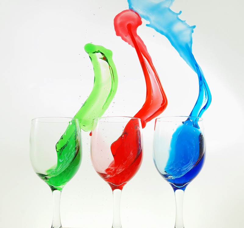
1 - I think you can try to take the photo a little more far from the subject. I believe you could include all the blue inside the image and get a better photo.
2 - The background is too much white. This difficult to see the borders of the glasses.
Congrats and hope you enjoy my ideas.
Oscar |
|
 Photographer found comment helpful. Photographer found comment helpful. |
|
|
04/03/2010 07:51:50 PM |
|
now that's a beauty! Love love love this shot! |
|
| Photographer found comment helpful. |
|
|
04/01/2010 01:16:55 AM |
|
Another great image Raj. Superb capture. |
|
| Photographer found comment helpful. |
|
|
03/31/2010 01:41:05 AM |
At first I thought you were fooling us. Now that I've seen your notes I have to appologize for even daring to think this.
Congrats on your top 20 :) |
|
| Photographer found comment helpful. |
|
|
03/31/2010 12:07:22 AM |
|
This was AWESOME!! I seriously expected this to get a ribbon of some sort, VERY WELL DONE!! |
|
| Photographer found comment helpful. |
Comments Made During the Challenge  |
|
|
03/28/2010 06:44:35 PM |
|
Cool. Would be interested in how you did it. |
|
| Photographer found comment helpful. |
|
|
03/28/2010 12:38:23 PM |
|
I love this! The simplicity of the composition and colors are powerful. Well done! |
|
| Photographer found comment helpful. |
|
|
03/27/2010 06:30:32 PM |
|
uuuupsssssss,,,, beautiful color,, i like,,,,,,, |
|
| Photographer found comment helpful. |
|
|
03/27/2010 12:49:55 PM |
|
Don't hate me - I love this photo, but I would have loved it more if the red didn't find a way into the green, or the red and blue mixing towards the top. Granted - I'm not sure how you'd prevent that - but I found the mixing distracting from the stark differences of the colors you were trying to convey. No worries - 9 |
|
| Photographer found comment helpful. |
|
|
03/25/2010 04:58:35 PM |
|
These colour shots are allways striking. Well balanced, with the increase of the spilled liquid to the right |
|
| Photographer found comment helpful. |
|
|
03/24/2010 10:04:22 PM |
|
| Photographer found comment helpful. |
|
|
03/24/2010 03:25:19 PM |
|
I have the idea the glasses are just laying down and that you're fooling us ;) |
|
| Photographer found comment helpful. |
|
|
03/24/2010 10:45:19 AM |
|
I'm guessing this photo has been rotated 90º? Very good. |
|
| Photographer found comment helpful. |
|
|
03/24/2010 08:23:38 AM |
|
This has that art/abstract feel. I like the vivid contrasts. |
|
| Photographer found comment helpful. |
|
|
03/24/2010 04:37:15 AM |
|
lots of jelly, I guess. well done! |
|
| Photographer found comment helpful. |
|
|
03/24/2010 01:11:12 AM |
|
| Photographer found comment helpful. |
Home -
Challenges -
Community -
League -
Photos -
Cameras -
Lenses -
Learn -
Help -
Terms of Use -
Privacy -
Top ^
DPChallenge, and website content and design, Copyright © 2001-2026 Challenging Technologies, LLC.
All digital photo copyrights belong to the photographers and may not be used without permission.
Current Server Time: 06/29/2026 03:20:08 PM EDT.