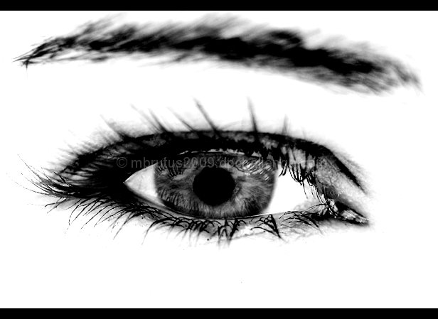
Composition and Lighting: Pretty straight forward and yet not at all. I don't often see such high contrast images on DPC, and that isn't a big surprise because I think they may be too artistic for DPC - kind of like this image. Anyways, I love the creativity of this image. Lovely contrasts.
Thou what is with the trend of black borders on the top and bottom?
Technical: Larger! I agree. Why constrain yourself to 616 pixels wide? Also, nitpicking, it bothers me that some lashes are totally blurry and others seem overly sharp.
Overall: I do like it! First shot of an eye, awesome job. Keep up the good work.






 Add photograph to your favorites
 Add photographer to your favorites

 Photographer found comment helpful.


