| Author | Thread |
Comments Made During the Challenge  |
|
|
03/14/2010 03:43:15 PM |
|
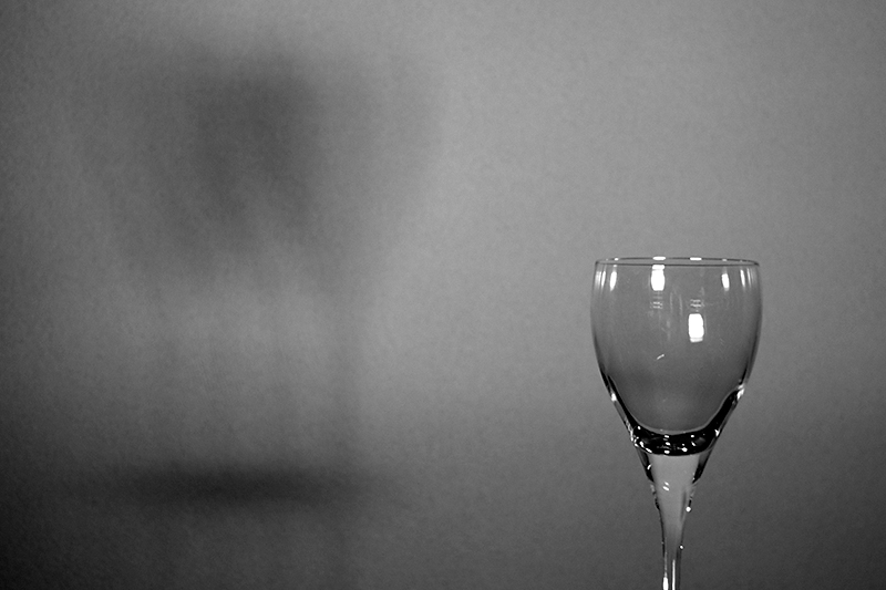
3 - Shadows too subtle and the mix of grain - isn't really enhancing this or making any real statement, the glass is chopped and also tilted and the reflections on it, cropped as is, don't bring anything to the image. |
|
 Photographer found comment helpful. Photographer found comment helpful. |
|
|
03/14/2010 12:17:49 PM |
|
Wish the shadow were just a bit stronger. I do like the limited mid-key tonal range. |
|
| Photographer found comment helpful. |
|
|
03/14/2010 09:56:57 AM |
|
Sorry I am just not a fan of this. For my taste it just seems too dull and not much there to draw me in. Good luck. |
|
| Photographer found comment helpful. |
|
|
03/11/2010 03:45:24 PM |
|
the shadow definition is hard to see, good clarity on the glass |
|
| Photographer found comment helpful. |
|
|
03/11/2010 11:32:37 AM |
|
Though simple in composition (and maybe not perfect), this has a lovely early-era sensibility about it, perhaps 'forties. The background noise (wall texture?) is very pleasing. The shadow effect is nicely balanced with the object casting it. Thank you. |
|
| Photographer found comment helpful. |
|
|
03/09/2010 07:19:12 PM |
|
| Photographer found comment helpful. |
|
|
03/09/2010 12:05:48 PM |
|
would have liked to see the whole wine glass, stem and all |
|
| Photographer found comment helpful. |
|
|
03/08/2010 12:50:54 PM |
|
Very nicely rendered but the impact would have been greater if the stem of the glass was included in the frame imo. |
|
| Photographer found comment helpful. |
Home -
Challenges -
Community -
League -
Photos -
Cameras -
Lenses -
Learn -
Help -
Terms of Use -
Privacy -
Top ^
DPChallenge, and website content and design, Copyright © 2001-2026 Challenging Technologies, LLC.
All digital photo copyrights belong to the photographers and may not be used without permission.
Current Server Time: 07/15/2026 05:29:28 AM EDT.