| Author | Thread |
|
|
02/26/2010 12:13:46 PM |
Greetings from the Critique Club
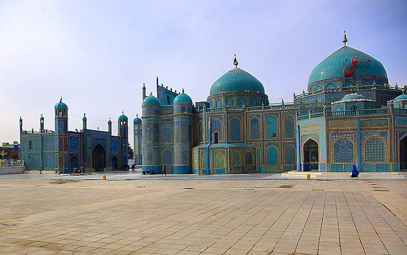
Stunning image and FWIW, I gave it a high score during competition. Your colors are splendid and your perspective is good. The woman in blue is a huge bonus.
You did receive some good comments on this image. The one thing that struck me was that this composition is almost "Half and half." Usually the rule is one third/two thirds and in this case I do think that would have made for a much more effective use of your space. the structure is so beautiful and intricate that it could well have used all the detail you could give it. (And might even have shown up those white doves a bit better.) While frequently the long lead-in of pavement can be effective, in this case it may leave the viewer a little disappointed.
All in all, you received a good score for this good image and I'm very pleased to have the opportunity to look at it again, especially in depth for this review.
I'll look forward to seeing more of your images.
Alice |
|
Comments Made During the Challenge  |
|
|
02/23/2010 10:36:16 PM |
|
Sensor dust or lens dust all over the image. Easy enough to clean that out and it is allowed in this challenge. The comp is off balance and the subject is not real clear since the foreground has so much in front of the buildings. The buildings are really cool subject material. I would like to see more of the intricate details in the buildings. |
|
|
|
02/19/2010 03:05:45 PM |
|
|
|
02/18/2010 01:46:15 PM |
|
I think some of the ground could have been cropped out for a more dramatic few of the buildings and the light could have been toned down a bit in PP |
|
 Photographer found comment helpful. Photographer found comment helpful. |
|
|
02/17/2010 04:39:43 PM |
|
The large amount of wasted space at the bottom of the image doesn't complement the top half of the photo. There is a nice shot within this image - the woman in blue passing by the mosque, directly under the marquee - but I realize that wouldn't necessarily meet the challenge. Additionally, the building on the left doesn't make an impact and if the image was cropped to remove that, the main section of the mosque would be much more impactful. |
|
| Photographer found comment helpful. |
Home -
Challenges -
Community -
League -
Photos -
Cameras -
Lenses -
Learn -
Help -
Terms of Use -
Privacy -
Top ^
DPChallenge, and website content and design, Copyright © 2001-2026 Challenging Technologies, LLC.
All digital photo copyrights belong to the photographers and may not be used without permission.
Current Server Time: 06/30/2026 01:44:16 PM EDT.