Gong for a minimalistic and science fiction feel on this.
Post:
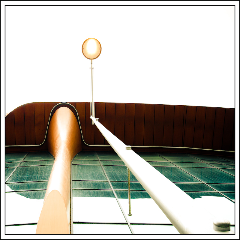
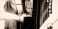
Thanks to everyone for the great comments and score on this. Yes, it is the outside of a building with street light. Here's the unedited image. I purposely over-exposed when shooting as i wanted just the colour and texture to come out of the white to give a more oscure abstract feel.
See also, some abstracts i made from the image...
Statistics
Place: 22 out of 163 Avg (all users): 6.2439 Avg (commenters): 7.8000 Avg (participants): 5.8462 Avg (non-participants): 6.4286 Views since voting: 1154 Views during voting: 361 Votes: 205 Comments: 28 Favorites: 4 (view)
Greetings from the Critique Club.
Hello Clive, I'm Alan.
Sometimes the problem with being on the Critique Club is , one has to be careful finding the right balance of words to both inspire yet attempt to assist gently, and then there are times like this. How do I critique a image, no, art, above and beyond what I am capable.
Inspiration… Mine, it seems I have enjoyed your art in the past, it’s well beyond the time to list as favorite photographer, to study, so says the student.
Ok the gentle assist, ummm…ummmm, oh hell, never mind.
I guess I was the wrong person to critique your photo.
Alan
when I saw this I said; "W T F is that?!" (I am censoring myself here) Congratulations, you elicited a shocking response in me, you've done your job as an artist.
The colors aren't offensively popped and it are blended well with the over exposure. The unusual shapes are great!
Beautiful high key.
Great perspective.
1* short of 10* just because the double black border is distracting. Just the inner one would have worked fine IMHO.





 Add photograph to your favorites
 Add photographer to your favorites



 Photographer found comment helpful.


