| Author | Thread |
|
|
03/30/2010 09:39:55 PM |
|
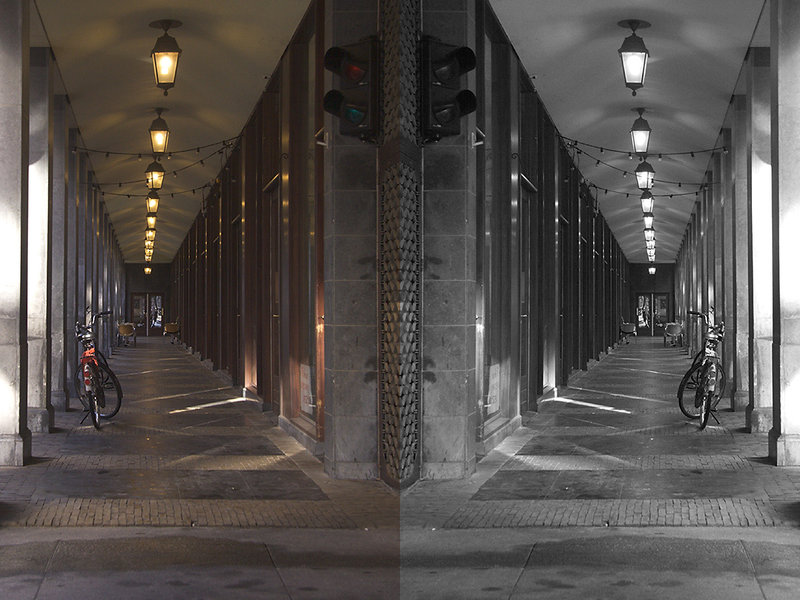
I think I like the B&W best. |
|
 Photographer found comment helpful. Photographer found comment helpful. |
|
|
03/02/2010 11:59:23 PM |
|
This is fantastic, the sides actually look a bit different to me. Clever idea. |
|
| Photographer found comment helpful. |
|
|
02/27/2010 12:04:44 PM |
|
I agree with the others, the mirrored diptych is really cool |
|
| Photographer found comment helpful. |
|
|
02/12/2010 04:54:17 AM |
|
Also think the accidental (?) diptych is uber cool. I like both but the colour one has the feel of an era gone by and I like seeing the colour of the robots (oops - traffic lights - must remember not to use South African slang on here, but thought you might find our name for them interesting) I think though that you could benefit from punching up the contast perhaps? Maar baie mooi. |
|
| Photographer found comment helpful. |
|
|
02/09/2010 05:00:09 AM |
|
Actually i think they compliment each other a great idea with this capture. |
|
| Photographer found comment helpful. |
|
|
02/08/2010 06:20:06 PM |
|
Neat concept, nicely executed. The side-by-side actually brings out the best in each view. |
|
| Photographer found comment helpful. |
|
|
02/08/2010 05:17:10 AM |
what a great idea
really like what you did here and as a diptych
both versions have their own merit its hard to choose between them both |
|
| Photographer found comment helpful. |
|
|
02/07/2010 07:44:00 PM |
|
I can't help you with a decision, both versions look really good - but, together, they are something else! I love the combination. |
|
| Photographer found comment helpful. |
|
|
02/07/2010 12:38:35 PM |
|
A nice idea the b&w loks more crisp to me |
|
| Photographer found comment helpful. |
|
|
02/07/2010 12:19:46 PM |
|
I like them both. The total effect is like having the bow of a ship come straight at you. Nice idea -- well-executed. |
|
| Photographer found comment helpful. |
|
|
02/07/2010 08:41:29 AM |
|
I agree. I also prefer the b&w, although I think a little more blacks would make it pop more. |
|
| Photographer found comment helpful. |
|
|
02/07/2010 05:30:12 AM |
|
b&w - better emphasizes the lines |
|
| Photographer found comment helpful. |
|
|
02/07/2010 05:20:42 AM |
|
And that makes a rather nice diptych :) |
|
| Photographer found comment helpful. |
Home -
Challenges -
Community -
League -
Photos -
Cameras -
Lenses -
Learn -
Help -
Terms of Use -
Privacy -
Top ^
DPChallenge, and website content and design, Copyright © 2001-2026 Challenging Technologies, LLC.
All digital photo copyrights belong to the photographers and may not be used without permission.
Current Server Time: 07/16/2026 12:42:33 PM EDT.