Greetings from the Critique Club
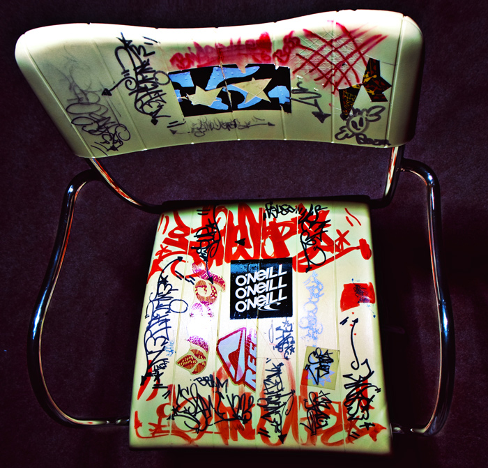
Judging from the votes this was ok image. I think it needed a setting to help it really stand out. The perspective is unique but unfortunately in this case it doesn't make the image stand out. This chair in the right setting could really work well (empty ware house or by the back of an old building comes to mind). As a subject for this challenge, this chair has a lot of potential.
Technically: Focus is ok. It might have needed a bit more depth of field. There's a couple of spots that are a bit hot and the shadows fall of strangely for some reason. (almost like dodging and burning was used with a heavy hand?)
Composition: Really not much to say here. The chair is plunked down in the middle of a square frame. Central composition and square framing work well if you want to depict symmetry and balance. With this type of subject you'd want to go for something more dynamic I think. |





 Add photograph to your favorites
 Add photographer to your favorites

 Photographer found comment helpful.


