| Author | Thread |
|
|
02/01/2010 05:07:21 AM |
|
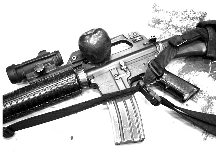
I do like the re-edited version better, but I enjoyed a good laugh with the first one. (I'm one of your 7s.) Perhaps if the title had been a little less subtle others would have gotten the humor. I would have preferred a lighter colored apple which would have stood out more on the first version. Hope you have a grand time here and thank you for serving! |
|
 Photographer found comment helpful. Photographer found comment helpful. |
|
|
02/01/2010 04:06:40 AM |
I like the contrast on the rifle and apple more on this. You've got a better range of tones, going from 0 to 255, and you can see a lot more detail on the rifle. There are some overly blown areas that are not specular highlights in a few places though. The apple is more apparent, which is good. Overall, I prefer this one, but I wouldn't vote it terribly high either.
The areas where there is still wood grain showing and the paint or whatever that is on the board is really distracting. You likely got hit on things due to your subject matter and the fact that you didn't focus on the challenge idea, which was fruit, as well. The fruit strikes me as an afterthought, not a subject. |
|
Home -
Challenges -
Community -
League -
Photos -
Cameras -
Lenses -
Learn -
Help -
Terms of Use -
Privacy -
Top ^
DPChallenge, and website content and design, Copyright © 2001-2026 Challenging Technologies, LLC.
All digital photo copyrights belong to the photographers and may not be used without permission.
Current Server Time: 06/20/2026 05:21:41 AM EDT.