First let me start by saying this isn't my idea, I saw a very similar shot (though better than mine) over at 1x the other day, it immediately struck me that I would love to recreate it for this challenge.
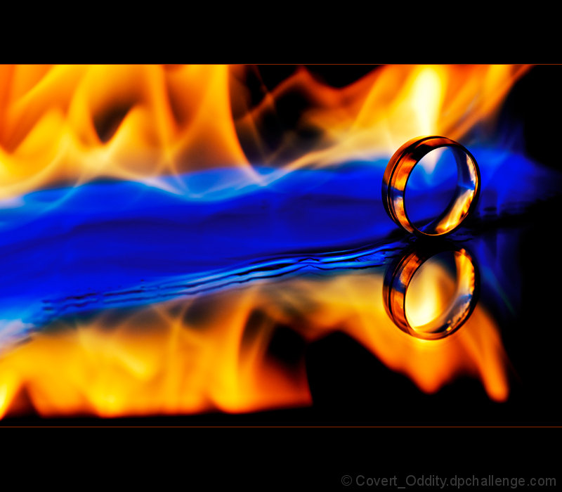
The setup is a mirror with a black background placed up behind the shot. The ring is stuck to the mirror with a very small piece of blu-tak to stop it moving.
The camera is tripod mounted, pre-focused on the ring and remote release used.
I poured rubbing alcohol onto the surface of the mirror, lit it, turned out the light and took lots of shots while it burned. The only light during the shots was that of the flame itself.
Editing was just RAW adjustments (shadows / highlights, black point, saturation, vibrancy), then in Photoshop I did a simple curves and selective colour to bring out a bit more red in the flame and make the yellows & blues more striking. Lastly I resized and USM before adding a border.
I'm really pleased with the way it turned out, the only changes I would make if this was advanced is to smooth out the edge of the liquid to make it less noticeable, and get rid of a couple of black spots along to the left.
For those of you who are interested, here's the shot that inspired me:
A couple of people have been asking how this was done, especially in basic, but in truth there's actually nothing mysterious or clever about it.
The blue is the colour you get when you burn alcohol, it's completely natural, and the clean look is because I was using alcohol to burn, so after each attempt I had to wipe the remainder off and since alcohol is perfect for cleaning glass it was spotless by the time I took this version :)
OK, now this is just weird. I saw I had a couple of new comments and read "Congratulations on the blue", I was thinking, blue, huh, what??
With the first two images disqualified, I'm wondering if I'm next!
Statistics
Place: 1 out of 83 Avg (all users): 6.7546 Avg (commenters): 8.4615 Avg (participants): 6.3333 Avg (non-participants): 6.8186 Views since voting: 6943 Views during voting: 508 Votes: 273 Comments: 38 Favorites: 11 (view)
See? I told you it was a great picture. Considering that it is now blue, are you sure you know where that ring came from? Or does it have a will of its own to dominate all others? Kind-a scary if you think about it...
LOL, looking at it that way, I should probably get rid of that ring, or perhaps use it in more shots :)
See? I told you it was a great picture. Considering that it is now blue, are you sure you know where that ring came from? Or does it have a will of its own to dominate all others? Kind-a scary if you think about it...
Greetings from the critique club.
Hello Iain, I’m Alan.
This is really a easy Critique. Your colors, contrast, DOF are spot on. Though not a original Idea as you mentioned, it was well executed, and deserves the score and placement it received. The only negative I can find on your image is the fuel line that is a bit of a distraction, but with the restrictive editing in basic I fail to see how you could have altered that. And so brings up your claim that your attempt is somehow sub par to the Original (?) idea by Dave Nitsche on 1X. I think here you are comparing apples to oranges, similar in concept only. I think your transitions in the flames are much smoother. Dave was able to use any editing software at his disposal and was not restricted in file size, in a similar situation I’m sure you could have removed the offending fuel line, in what, about a half a hour, surpassing presentation in eye appeal.
This was very well done, and congratulations on your ribbon..
Alan
Have to disagree with you. The 1x picture was not nearly as good as yours. You can see the sticky tape on the mirror, and I like the blue in yours rather than the all-yellow of theirs.
Congrats! This was my #1 pick. Nice to hear about the setup and the effects of alcohol on the mirror, I might try this now knowing that I won't ruin the mirror with fire.
Nice rich colors, nicely set up / composed. I would prefer a more traditional frame -- or none at all, the image is strong enough to stand by itself. (no vote -- just a comment)
Awesome work... great colors, composition, DOF, and conceptually very strong. As a bit of a LotR nerd, I'm bothered by the fact that the ring isn't a plain gold band--but this is nonetheless a very pretty image to look at.
One of my top picks--good luck in the final ranking!
I really like this, the concept is wonderful and you are right it can really rule it all!! Love the placement of the subject (the ring), the fire and the contrast of the cool blue makes this a really HOT image. Love it.





 One Ring To Rule Them All
 Add photograph to your favorites
 Add photographer to your favorites

 Photographer found comment helpful.


