hehe you beat out the other similar image, and although i still stand by my technical evaluations it just goes to show how subjective art is... or it could mean that its time for me to check my monitor :-) congrats on the top 10!
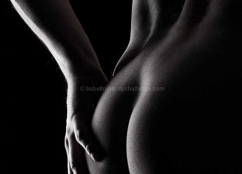
very similar to another image in this challenge called skindeep... that one imo is much better executed for a number of reasons - the composition is better (uses rule of thirds very effectively, and puts the negative space to work), tones are better (uses a straight forward b/w rather than a semi sepia look), lighting is better (note the harshness of the light in yours on the forearm, the flow and leading lines are also better. Hopefully you can get a chance to take a look at that one and compare them and hopefully use it as a learning experience.






 Add photograph to your favorites
 Add photographer to your favorites

 Photographer found comment helpful.


