Hi Keith, greetings from the Critique Club!
Welcome to DPC, I hope you are enjoying yourself so far :)
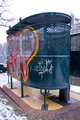
Composition
A square crop could have been better. The arrow and border on the right distracts a bit from the main subject, that is the writing.
Processing
A bit flat, you should have made it a bit brighter and with more contrast, so it would stand out.
Overall
As you can see, the shot appealed to the commentators. However, it must have been considered DNMC (Does Not Meet Challenge) by most of the users, as it's not actual graffiti but more on the likes of stencil, thus not gaining higher votes from the voters.
Try to direct yourself more to the purpose of the challenges, when the title is objective.
If you have any questions feel free to contact me.
Regards,
Joao
|