Greetings from the Critique Club.
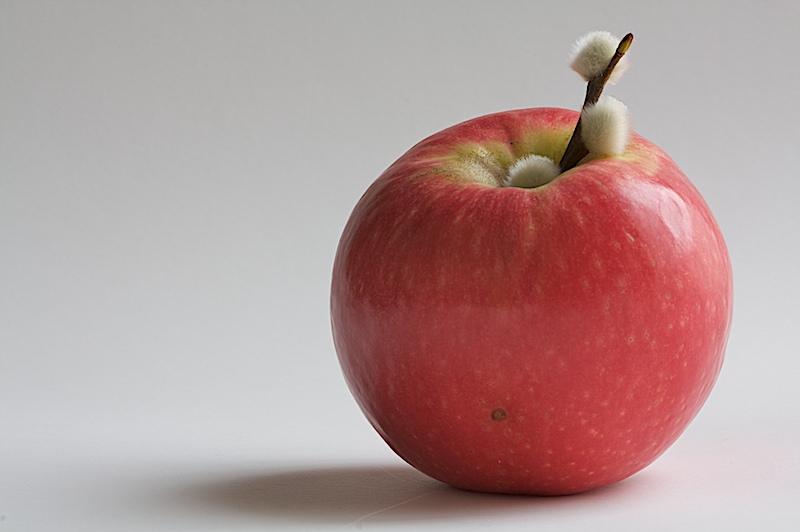
First impressions are that this has a nice minimalist feel to it and that is good.
Technically the composition is good and the lighting is fine, if not just a little bit flat.
Artistically there are two things I think let this shot down. First, what are those things on the apple stalk? They don't add value and take away from the uncomplicated feel this shot has. Also, the grey background seems to be too bland, a different colour (not too colourful) or a slight pattern perhaps?
In summary this shot is ok and has great potential but just doesn't pull it off.
PS: Get out there and cast some votes ;)
Feel free to PM
me if you have any queries.
Gerry |







 Add photograph to your favorites
 Add photographer to your favorites

 Photographer found comment helpful.

