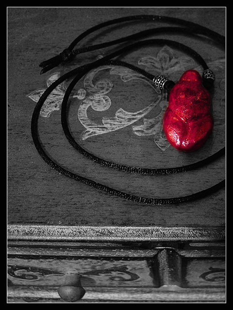
I love this necklace, which was made for me by a friend of mine. The colour is not as vivid as in the photo, but I thought some oversaturation was in order for this particular image.
I had several different ideas, the first and most generic of which was a flower, but decided to go with something abstract. I know it won't do well, but I still really like this one for some reason.
Editing: Cropping, resizing, selective desaturation, hue/saturation, curves, burning/dodging to correct some shadows, sharpening, border.
Statistics
Place: 159 out of 227 Avg (all users): 4.9212 Avg (commenters): 6.0000 Avg (participants): 4.7742 Avg (non-participants): 5.1519 Views since voting: 739 Votes: 203 Comments: 3 Favorites: 0
You know how much I love this picture. The first issue is the red part of the pendent is an un indentible object. The workmanship separating the item from the background is excellent. What's missing in this picture is balance and the viewer has no idea what colors are missing - perhaps the wood always looks this way. I would have left part of the wood inlay on top in color or the inlays on the drawers in color.





 Add photograph to your favorites
 Add photographer to your favorites


 Photographer found comment helpful.

