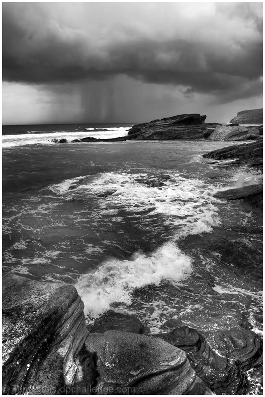
personally for me the rocks in the foreground don't add to this picture...I like the top part of the picture much better...not enough definition between the rocks and the water at the bottom
An oceanscape scene that has strong potential to move into the high above average and mayhap the exceptional category. The B&W is a nice choice for it calls attention to all the textural details from the rough strata of the rock to the cresting of the crashing waves. There is alot of visual interest here BUT where the photo suffers is the strong dynamic range of tones. Oh, the contrast are not so bad that it appears flat it is just that it is not quite there for it to reach it's maximum potential. I have a feeling that playing around with Shadows/highlights/midtones and maybe the elusive S-curve (have yet to master that PP tool) would make the blacks a deeper and 'richer' dark tone increasing the contrasts between the dark and the light tones. Once that strong contrast occurs I can then see this ocean scene becoming as very visually eye-popping off the screen.






 Add photograph to your favorites
 Add photographer to your favorites


 Photographer found comment helpful.


