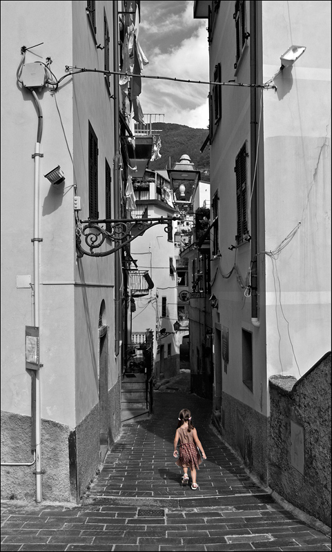
this technically is nothing flash but i love how the little girl appears to not have a care in the world as she walks up this alleyway home in Monterosso Italy.
Statistics
Place: 244 out of 445 Avg (all users): 5.7590 Avg (commenters): 5.9444 Avg (participants): 5.7435 Avg (non-participants): 5.8103 Views since voting: 767 Views during voting: 374 Votes: 249 Comments: 20 Favorites: 0
Ah, selective desat, love or hate it as the commenters made obvious. I like it so long as it works for the shot, and as I personally did a shot very like this for precisely the same reason - to highlight a little girl's aloneness - I am very taken with it. The tall buildings flanking her and the b/w give almost a Hitchcockian feel to the shot, like something awful might happen to her. But not yet.
Yes, the usual rule of thirds is *dangerously* close to being violated here. Good! Rules should be bent every so often. The light is a little hard, but helps highlight how alone she is imho. The swing of her dress, one foot lifted, swing of her hands and pigtail...she looks like she has a sense of purpose about her. As a child I was a loner too, and she seems to have that same sense of confidence about her. I don't sense trepidation or fear on her part.
Overall, I think this shot should have placed much higher with the carefreeness of the girl standing out in stark contrast to her surroundings.
Not really a big fan of selective desats in general, and while this is one of the better uses of it, I still don't like it particularly. All B&W or all colour and I would probably have preferred this.
What and absalutely cute pic. It works 100% Amazing what difference this little girl makes to the pic and the feelings it evokes amidst the jumble of buildings towering above her. 9 Im a sucker for this
An interesting location, but there are a lot of elements and distractions to grab the eye. The black and white contrasting against the slight red of the dress does help draw the attention to the girl in the image, however she does seem a little small in the image.........it does help emphasis her alone status though......The very tall crop though I dont think really was needed, as plenty of dead space and distracting elements could have been removed at the upper part of the image with a more conventional crop ratio





 Add photograph to your favorites
 Add photographer to your favorites

 Photographer found comment helpful.


