| Author | Thread |
|
|
01/27/2010 09:19:03 PM |
|
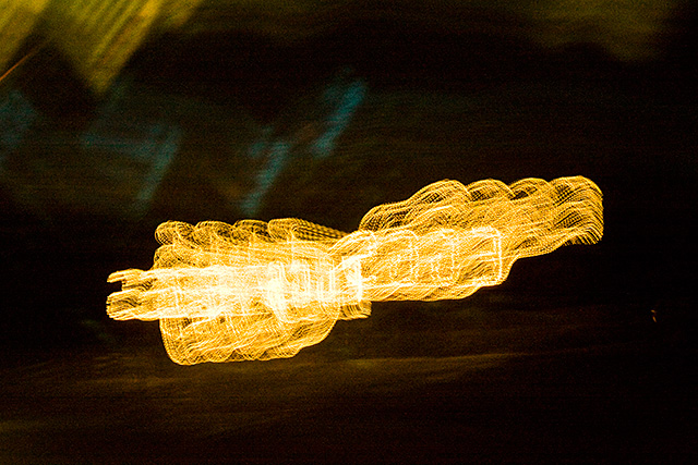
I like the other version better..this one hurts my eyes :) |
|
 Photographer found comment helpful. Photographer found comment helpful. |
|
|
01/23/2010 11:54:28 PM |
|
I like the color version. The bright contrast catches my attention more and makes me wonder what the message is in the lights. |
|
| Photographer found comment helpful. |
|
|
01/18/2010 06:21:07 AM |
|
I think I like this one more - I really enjoy the 70's type colours and I like the sense of reflection. This one becomes a texture study as well for me, which I love. Also prefer the composition, feels like an artwork where the other is more observational for me. |
|
| Photographer found comment helpful. |
Home -
Challenges -
Community -
League -
Photos -
Cameras -
Lenses -
Learn -
Help -
Terms of Use -
Privacy -
Top ^
DPChallenge, and website content and design, Copyright © 2001-2026 Challenging Technologies, LLC.
All digital photo copyrights belong to the photographers and may not be used without permission.
Current Server Time: 07/16/2026 09:55:31 AM EDT.