| Author | Thread |
Comments Made During the Challenge  |
|
|
01/12/2010 12:15:36 AM |
|
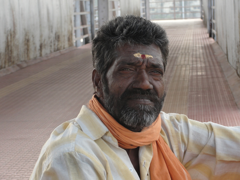
There is a large amount of dead space on the left side of the photo. May crop it so that the subjects "third eye" is centered?? |
|
 Photographer found comment helpful. Photographer found comment helpful. |
|
|
01/11/2010 10:46:14 PM |
|
I like the composition very much, but the face seems under exposed compared to the background. |
|
| Photographer found comment helpful. |
|
|
01/10/2010 09:00:17 PM |
|
I love how the colors work together...Good job. |
|
| Photographer found comment helpful. |
|
|
01/09/2010 04:20:27 PM |
|
I think you have a real fantastic photo on your hands here. I would highly recommend a tighter crop next time. I think there is too much space on the left, and even a bit on top. I dont care whats on the left, so why show it so much? |
|
| Photographer found comment helpful. |
|
|
01/09/2010 09:30:49 AM |
|
Great subject and nice shot, though I think a tighter crop might be more suited |
|
| Photographer found comment helpful. |
|
|
01/08/2010 11:29:42 AM |
|
The center composition takes away the impact. The focus also could have been better |
|
| Photographer found comment helpful. |
|
|
01/06/2010 02:06:23 AM |
Would have cropped more of the background.
More focus needed on eyes imo. |
|
| Photographer found comment helpful. |
Home -
Challenges -
Community -
League -
Photos -
Cameras -
Lenses -
Learn -
Help -
Terms of Use -
Privacy -
Top ^
DPChallenge, and website content and design, Copyright © 2001-2026 Challenging Technologies, LLC.
All digital photo copyrights belong to the photographers and may not be used without permission.
Current Server Time: 06/28/2026 10:33:50 AM EDT.