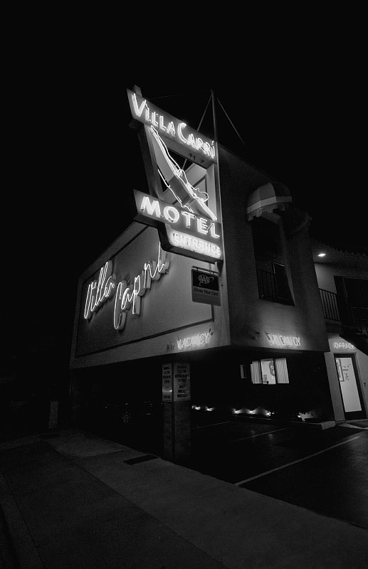
I think the reason it places lower is lack of color to catch the eye. I shot it for the neon colors but decided it looked really cool in black an white- sort of a film noir look. Thanks for the encouraging comments!
OK, I'm going through the Free Study submissions, purposefully finding those images I think are shot with a less conventional eye - this is one of those images! Thanks for offering something that isn't just DPC friendly eye-candy (though of course there's nothing wrong with eye-candy). I'll be picking one of these images for the Mu (most underrated) award:
Positives: I really like the angular composition here and the overall clarity of the image. Brave to present neon in monochrome but I think your image is strong enough to carry it.
Critical stuff: Not too much really - I think I'd rather see the neon in colour but then that isn't what this image is about.
This is an interesting piece though for me it appears as if it is falling over backward. I would have enjoyed a stronger structure line that solidifies the building while the rest angle.






 Add photograph to your favorites
 Add photographer to your favorites

 Photographer found comment helpful.


