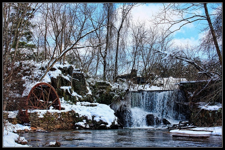
I agree that this appears to be way over sharpened. I disagree about converting it to B & W. I like all the blue and white with the contrasting red wheel. I'd like to get my chainsaw in there and remove a lot of the branches, not most, but a lot of them as well as some of the trees. But that's probably not something that you can realistically do. Yep, I would definitely like to see this reworked without as much sharpening.
Too much happening at the same range of contrast for my eyes to target on an interesting point to appreciate. Maybe saturating the reds in the water wheel would give us a point to focus on. The two trees bending inwards from each edge of the image point to nothing interesting for me to want to continue looking there. What I noticed with my own outdoor shots during the winter season was that I attained a kind of abstract look to them because of the many inter-winding lines the branches create. That may be happening here.
I saw your post and questions about why this scored where it did. I will admit that was one of your 4s. I found the processing to be very overdone here. The sky had an unrealistic hue, the waterfall also had an artificial look due to the saturation of the blues.
I saw the comment about cluttered and I think that is what bothers me most. i understand there is not much you can do about the various trees and shrubs in the scene that create dissorder and the look of clutter, but it still feels like 'too much' is in the image for us to reasonably approach it.
I think this does have the classic winter postcard appearance, but the saturation and oversharpening seem to have worked against you in this case.
Lovely pic but I feel this would have scored better with a slower ss for falls to be softer. Still a very nice shot. I would def go back if you could and take again.





 Add photograph to your favorites
 Add photographer to your favorites


 Photographer found comment helpful.


