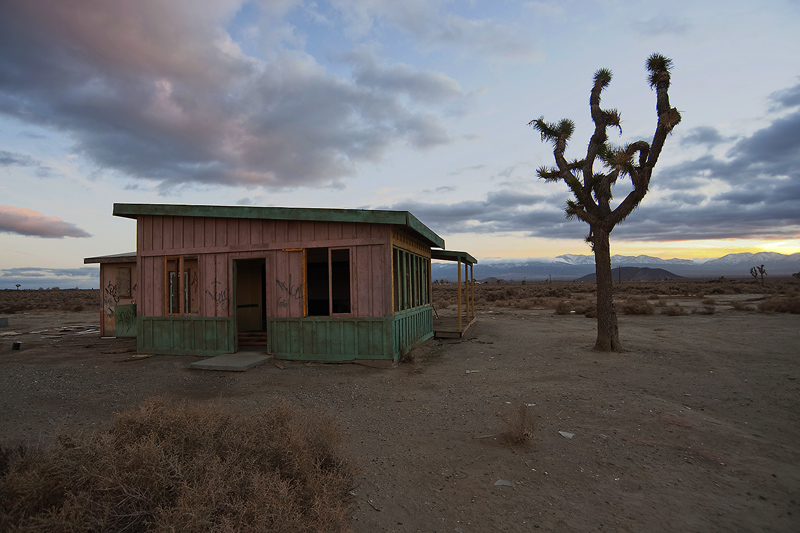
The location is between Lancaster, CA and Victorville, CA.
I tried to keep it dark but the comments suggest I use more light - I just tried this and here is the updated version:
Statistics
Place: 36 out of 82 Avg (all users): 5.7368 Avg (commenters): 6.0000 Avg (participants): 5.7297 Avg (non-participants): 5.7396 Views since voting: 802 Views during voting: 251 Votes: 133 Comments: 7 Favorites: 0
Great sky, good colors in the building, and interesting shape in the tree. I like it. I think the image could be improved if you cropped it more tightly, e.g., got rid of some of the foreground, which isn't very interesting.
It does look lonely. Not as decrepit as a lot of abandoned places and the perspective seems rather ordinary to me. Might have been more interesting to me from down lower and/or a different angle.
I do like this great scene but (I almost hate myself for saying this) it seems under-edited. Perhaps you wanted a very authentic depiction and I should respect that but I feel there is so much untapped potential in this image (in terms of contrast, colour, tone and texture).
I'd be really interested to know whether that was an active choice or absence of software.
The darkness of the foreground says this image is mostly about the sky. I think lightening the foreground shadows would carry the message more effectively. Mild HDR or PS shadows/highlights followed by some contrast enhancement could be effective tools.





 Add photograph to your favorites
 Add photographer to your favorites


 Photographer found comment helpful.


