| Photograph Information |
Photographer's Comments |
Challenge: Free Study 2009-11 (Advanced Editing VII)
Collection: Things
Camera: Nikon D200
Lens: Nikon AF Nikkor 50mm f/1.4D
Location: Plainfield, NJ
Date: Nov 27, 2009
Aperture: f/20
ISO: 200
Shutter: 1/40
Galleries: Textures
Date Uploaded: Nov 30, 2009
|
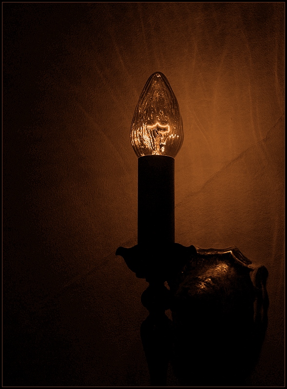
Complete with wrinkled textured old plaster on the walls, but modern enough to use a lightbulb ... which struck me as incongruous. Love the texture on the wall, the diagonal where the plaster was fixed once, the texture of the sconce base and the reflected light on the wall. Looks like a painting, except for that lightbulb.
At my in-law's house, so not my grandma, but *a* grandma with a wonderfully quirky old house.
Not expecting a great score from this, but I do like it.
PP - HDR/tonemap in qtpfsgui (pregamma 1, method reinhard05, brightness 14.2, chromatic adaptation 1, light adaptation 0); opened in PhotoImpact, cropped, slight dodge on some details and burn on wall and filament, duotone, resized, sharpened, added border. |
| Author | Thread |
Comments Made During the Challenge  |
|
|
12/03/2009 07:30:58 PM |
|
This demonstrates your mastery of camera and post processing. It's well composed. But for me the subject isn't that interesting. |
|
 Photographer found comment helpful. Photographer found comment helpful. |
|
|
12/03/2009 03:01:11 PM |
OK, I'm going through the Free Study submissions, purposefully finding those images I think are shot with a less conventional eye - this is one of those images! Thanks for offering something that isn't just DPC friendly eye-candy (though of course there's nothing wrong with eye-candy). I'll be picking one of these images for the Mu (most underrated) award:
Positives: There is a great sense of texture to the wall and the glass and the just-enough light works really well with the coloration. The composition for your subject is pretty sympathetic too.
Critical stuff: I think the intrinsic interest level in this scene is very low and although I like what you have done with, I don't really feel that it adds up to something that can inspire as some other images too.
Overall: This is certainly a competent piece of work, but it isn't one that is pushing my buttons. |
|
| Photographer found comment helpful. |
|
|
12/02/2009 05:12:56 PM |
|
Not a bad start. I would suggest taking it more from the side, and exposing your image for just a little longer so it's brighter. Cool lamp! |
|
| Photographer found comment helpful. |
|
|
12/02/2009 11:47:49 AM |
|
not the most thrilling of pictures in the lot...sorry |
|
| Photographer found comment helpful. |
Home -
Challenges -
Community -
League -
Photos -
Cameras -
Lenses -
Learn -
Help -
Terms of Use -
Privacy -
Top ^
DPChallenge, and website content and design, Copyright © 2001-2026 Challenging Technologies, LLC.
All digital photo copyrights belong to the photographers and may not be used without permission.
Current Server Time: 06/28/2026 03:20:07 PM EDT.