| Author | Thread |
Comments Made During the Challenge  |
|
|
12/05/2009 06:07:22 PM |
|
even tighter zoom might have helped |
|
 Photographer found comment helpful. Photographer found comment helpful. |
|
|
12/04/2009 10:55:15 AM |
|
I wish I had an orientation point on this...I can't tell how large or small this is...your colors are good...and your focus good...but I can't tell about the macro side of this... |
|
| Photographer found comment helpful. |
|
|
12/03/2009 11:02:16 PM |
|
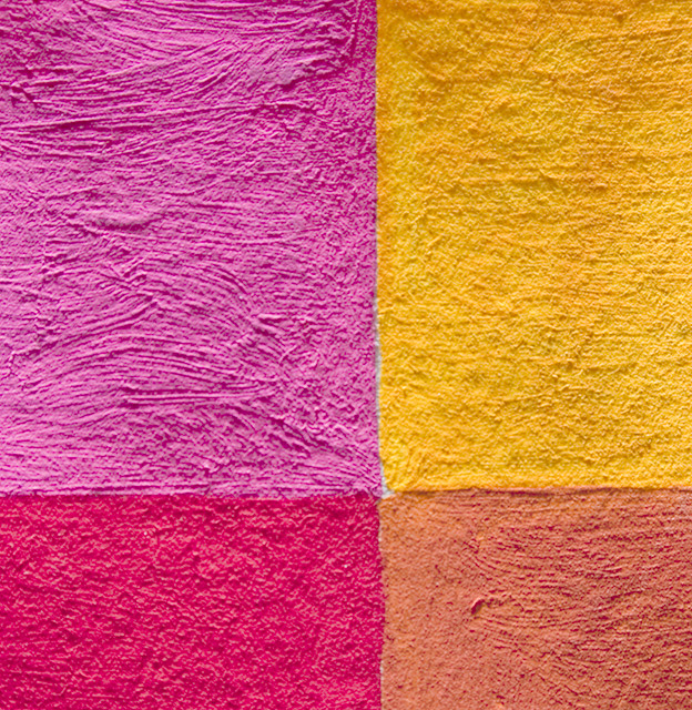
The 4 contrasting colours are greatly enhanced by the rough wall textures which highlight the paint strokes. This is simple and abstract, and also quite pleasant to view. |
|
| Photographer found comment helpful. |
|
|
12/03/2009 10:42:03 PM |
|
With such a strong geometric pattern, I think the horizontal and vertical lines need to be absolutely horizontal and vertical. Otherwise, this is a really nice capture. |
|
| Photographer found comment helpful. |
|
|
12/02/2009 04:24:37 PM |
|
Simple and effective. Nice colors. |
|
| Photographer found comment helpful. |
Home -
Challenges -
Community -
League -
Photos -
Cameras -
Lenses -
Learn -
Help -
Terms of Use -
Privacy -
Top ^
DPChallenge, and website content and design, Copyright © 2001-2026 Challenging Technologies, LLC.
All digital photo copyrights belong to the photographers and may not be used without permission.
Current Server Time: 06/29/2026 12:12:02 AM EDT.