| Author | Thread |
Comments Made During the Challenge  |
|
|
11/24/2009 11:26:10 PM |
|
 Photographer found comment helpful. Photographer found comment helpful. |
|
|
11/24/2009 11:16:59 PM |
|
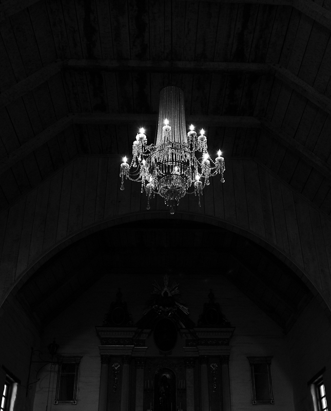
A tad Gothic looking, love it! |
|
| Photographer found comment helpful. |
|
|
11/24/2009 08:25:43 PM |
|
I hate interiors but this is really lovely. |
|
| Photographer found comment helpful. |
|
|
11/24/2009 01:49:14 PM |
|
well, in comparison to the other entries...this is not holding my attention as much...sorry |
|
| Photographer found comment helpful. |
|
|
11/21/2009 04:59:48 PM |
|
Good technicals to lite the subject and keep the background dark |
|
| Photographer found comment helpful. |
|
|
11/21/2009 04:11:35 PM |
|
My monitor view inadvertently crops this with just the crystal chandelier and a hint of the archway which is very effective in your chosen black and white due to repeating patterns of the ceiling and the curves of the alcove contrasting with the whiter lightsource. Scrolling down to see the rest of it became more distracting as it was a bit hard to discern all the darker details. |
|
| Photographer found comment helpful. |
|
|
11/21/2009 01:16:36 PM |
|
Back to comment - one of my higher scores given. I think this works really well. |
|
| Photographer found comment helpful. |
|
|
11/19/2009 10:39:04 PM |
|
Great simple shot! I have a feeling too many people will vote it down loosing details on black, which were visible just enough on my work computer but are missing on my home laptop (one of them needs to be re-calibrated). Gave it a 8 because the slight tilt is bothering me. I might be wrong but for a symmetrical shot there is something wrong! |
|
| Photographer found comment helpful. |
|
|
11/19/2009 10:00:15 PM |
|
neat idea, seems too dark overall and a little crooked..5 |
|
| Photographer found comment helpful. |
|
|
11/19/2009 10:20:28 AM |
|
Not a very interesting subject, and just a bit crooked. Nice balance between shadow and light though. |
|
| Photographer found comment helpful. |
Home -
Challenges -
Community -
League -
Photos -
Cameras -
Lenses -
Learn -
Help -
Terms of Use -
Privacy -
Top ^
DPChallenge, and website content and design, Copyright © 2001-2026 Challenging Technologies, LLC.
All digital photo copyrights belong to the photographers and may not be used without permission.
Current Server Time: 07/01/2026 01:28:51 PM EDT.