| Author | Thread |
Comments Made During the Challenge  |
|
|
11/07/2009 11:37:45 PM |
|
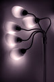
The DOF flattens the scene nicely to show off some good radial geometry. Nice! |
|
|
|
11/06/2009 04:50:23 PM |
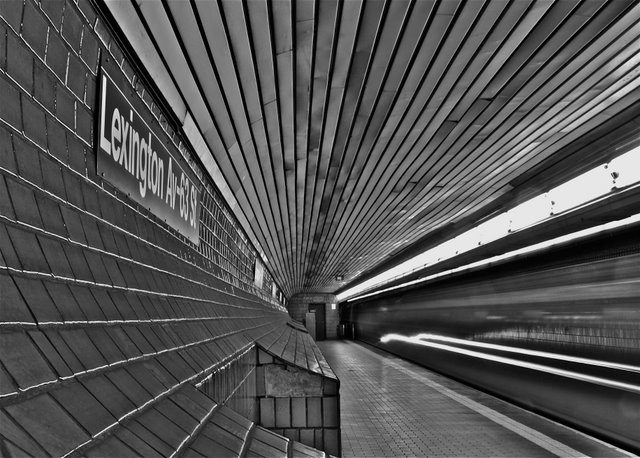
OK, I'm going through the Free Study submissions, purposefully finding those images I think are shot with a less conventional eye - this is one of those images! Thanks for offering something that isn't just DPC friendly eye-candy (though of course there's nothing wrong with eye-candy). I'll be picking one of these images for my Mu (most underrated) award:
Positives: There are so many things I like about this image - the perspective, its radial nature, its smooth look, the motion blur, the black and white treatment, the very slightly tone-mapped look (is it? Or is it just curves manipulation?); the placement of the door in the frame; the degree of obliquity of the sign.
Critical stuff: Nothing at all really - it does make me wonder about the colour version - but I trust you that the black and white is better, you've been right about every other choice in the image.
Overall: Great, visually full yet clean image. I hope it does well. |
|
|
|
11/01/2009 09:36:52 PM |
|
Nice B&W. So many leading lines. |
|
Home -
Challenges -
Community -
League -
Photos -
Cameras -
Lenses -
Learn -
Help -
Terms of Use -
Privacy -
Top ^
DPChallenge, and website content and design, Copyright © 2001-2026 Challenging Technologies, LLC.
All digital photo copyrights belong to the photographers and may not be used without permission.
Current Server Time: 06/30/2026 06:42:16 AM EDT.