| Author | Thread |
Comments Made During the Challenge  |
|
|
10/27/2009 09:13:04 PM |
|
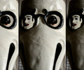
Would have been great if you froze the action a little better. |
|
|
|
10/23/2009 06:20:42 PM |
|
The two in-flight pictures take away from the bottom picture. I like the concept (especially with the position of the wings), but the blurriness hinders the overall effect. |
|
|
|
10/21/2009 08:27:11 PM |
|
Great attempt at a very difficult task. The bottom pane is very nice - I like the lighting and highlight of the bird's head / neck. Perhaps could lose a good deal of the tree at the far right of the bottom pane. Pan motion is very difficult - especially with a bird, and both of your top frames are OOF. Top left, the bird is almost in silhouette - without the one wing, it would almost look like a shadow. Top right pane, bird is still OOF, and its head is lost in the background. |
|
|
|
10/21/2009 02:21:24 PM |
|
Good layout and great colour. Top 2 are a little soft for my taste, though. |
|
|
|
10/21/2009 07:37:23 AM |
|
I like the overall idea and the way the panels are arranged. I feel however that the top pictures are not sharp enough (on the bird, that is), and that the bird does not stand out enough in the lower picture. |
|
|
|
10/21/2009 12:57:35 AM |
|
the top left hand image is too blurry, and i wish that the bottom image had been a tighter crop. the top right is almost right but still a little blurry! |
|
Home -
Challenges -
Community -
League -
Photos -
Cameras -
Lenses -
Learn -
Help -
Terms of Use -
Privacy -
Top ^
DPChallenge, and website content and design, Copyright © 2001-2026 Challenging Technologies, LLC.
All digital photo copyrights belong to the photographers and may not be used without permission.
Current Server Time: 07/01/2026 10:19:52 PM EDT.