Author Thread Comments Made During the Challenge
Post actions
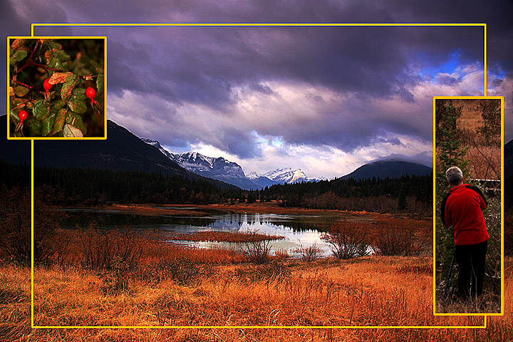
The main photo is fab, the berries work well, (placing them in the grassy area might have been better) but the person pic seems to detract from the overall image
Post actions
Not wild about that yellow border. Maybe a pencil thin black one would have served you better. That center scene is gorgeous.
Post actions
Very National Geographic.
Post actions
Great landscape – personally not that fond of the two smaller images. A 6.
Post actions
Nice pictures. I'm not sure if the yellow border color compliments them, though.
Post actions
Post actions
A different view at triptych. Great results.
Post actions
What a spectacular spot! Nice lighting.
Post actions
Post actions
My immediate reaction is that your main image needs rotating to get the trees upright. Nice idea though
Post actions
Beautiful Image. I know it will score high. Keep up the great work.
Post actions
I'm quite liking it but not sure why yet... lol will come back for another look later
Post actions
Post actions
the landscape is my favourite part of this image, i almost wish that the other two images werent there to bring it down :(
Post actions
The border hurts the overall presentation, IMO. Black or white or at least remove the large image border. The photos are nice and the set is otherwise well done.
Post actions
wow this looks like a post card......cool





 Add photograph to your favorites
 Add photographer to your favorites


 Photographer found comment helpful.


