| Author | Thread |
Comments Made During the Challenge  |
|
|
10/03/2009 05:46:56 PM |
|
 Photographer found comment helpful. Photographer found comment helpful. |
|
|
09/30/2009 04:17:13 PM |
|
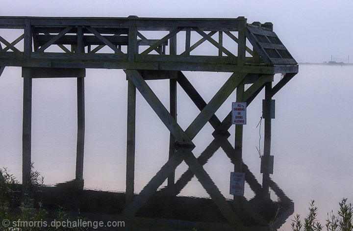
Could use a bit more color. It's so bland that I think going black and white would have been a better choice. |
|
| Photographer found comment helpful. |
|
|
09/28/2009 09:11:45 PM |
|
Interesting shot, but it seems dark to me. When there's a sign, you naturally want to read it. So your eyes are drawn to it, and then you notice that it should have been white, and you realize that it would have washed out the water too much, etc. The point is, it ends up being distracting. It seems like either lightening it or silhouetting it might have worked better... -5- |
|
| Photographer found comment helpful. |
|
|
09/28/2009 08:54:20 PM |
|
Good eye for that reflection. |
|
| Photographer found comment helpful. |
|
|
09/28/2009 10:02:33 AM |
|
Nice reflection,s perhaps a closer crop to remoe some of the forground would help to focus in on the x |
|
| Photographer found comment helpful. |
Home -
Challenges -
Community -
League -
Photos -
Cameras -
Lenses -
Learn -
Help -
Terms of Use -
Privacy -
Top ^
DPChallenge, and website content and design, Copyright © 2001-2026 Challenging Technologies, LLC.
All digital photo copyrights belong to the photographers and may not be used without permission.
Current Server Time: 06/29/2026 07:06:37 PM EDT.