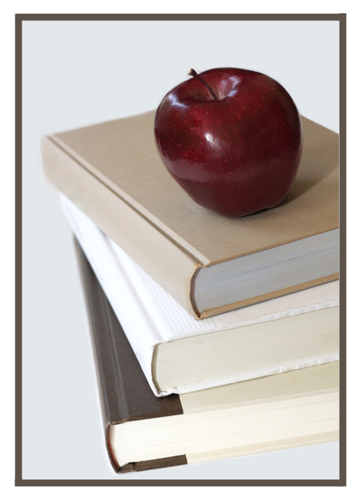
I like the tones of the book covers; however the image is generally flat and blown - check your Histogram - I bet there's a lot of dots to the far right side
could you have found a more dull colored set of books??? :-).. wowser.. beige, white & brown/beige.. Not the most interesting of images.. nice white balance although there is that problem with the white book being totally blown out in the center bind area.. nice pretty red apple though. it's a 4 for me.
The colors work very well in this photo. I also like the fact you didn't show the binders which allows the viewer to concentrate more on the book itself, rather than what the book is about. Very nicely done. A favorite so far!






 Add photograph to your favorites
 Add photographer to your favorites

 Photographer found comment helpful.


