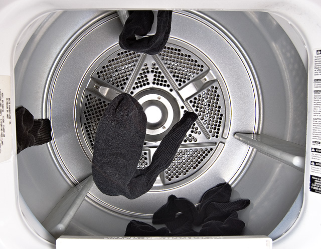
Lol i like this. Unique take on the challenge and nicely lit. Only nitpick is that the socks are a little grayish rather than black. Maybe some contrast might have helped. 7
I like the centered compositions and the B&W treatment. Not sure I like the positions of the socks, although I can not put my finger on why. Title might be a little wordy.
Clever title, O.K. pic. If you had lined up dead center your sides would have been square. The off-vertical lines are a bit distracting. Maybe a few more socks to make the point. Nice idea.
This is definitively one of my favorites in this challenge! I did not enter because I could not find an original idea for this subject. Congratulations on your funny creativity!
the intention of flying socks is great, it somehow doesn't work im eyes though, maybe a little motion blur would add to it... or more colorful socks? technically ok, 6






 Add photograph to your favorites
 Add photographer to your favorites

 Photographer found comment helpful.


