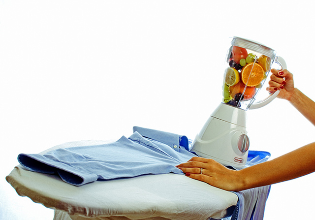
I had many ideas for this challenge but i finally settled on this. Had to do it twice too since the first time it wasn't very obvious that the blender was used for ironing, so someone suggested i use an actual shirt.
Expectation: 5.7
Hoping for: 6.4+
PP:
Raw conversion
Levels
Contrast
Curves
Shadows/Highlights
Saturation
Smart Sharpen
Crop
Resize for web
Eat fruits
Statistics
Place: 18 out of 71 Avg (all users): 5.9283 Avg (commenters): 7.2857 Avg (participants): 5.5625 Avg (non-participants): 5.9895 Views since voting: 1392 Views during voting: 423 Votes: 223 Comments: 17 Favorites: 1 (view)
First Impression: Certainly grabs my attention, I'm a big fan of negative space even with the small dpc images. Crisp, light, bright and humorous, I like it!
Composition: I do like the dynamics of your composition and did I mention I love the negative space? Maybe if you had cropped out the bottom of the Blironing board it would have been more pleasing and removed most of the blue bottom left. I'm a fan of odd angles as well, it works well for me here.
Subject: Nice idea to juxtapose the 2 main subjects however an ironing board doesn't shout appliance to me. Plenty of humour here, did you think of getting somebody to flick the switch on the wall for your final shot and blend the fruit?
Technical: A couple of minor niggles, the blue remnants of your post processing to get the bg bright and white background bottom left might have stopped this scoring the 6+ it deserved and the focus/colour on the arms is a little off for my liking.
Final thoughts:Love the idea and the shot you submitted, imho it was a couple of minor issues away from a ribbon so well done!
LOL..mix it up a little..nice lighting and comp..I'm not gonna ask how did you come up with that idea, because I've done and thought of weird things too...lol... :D 9...bumped to a 10
I like the right hand side with arms and the fruit. The left hand side is kind of weak with washed (pun unintended) colors. Perhaps a square crop of the left hand side would ahve more impact.





 Add photograph to your favorites
 Add photographer to your favorites

 Photographer found comment helpful.


