Greetings from the critique club!
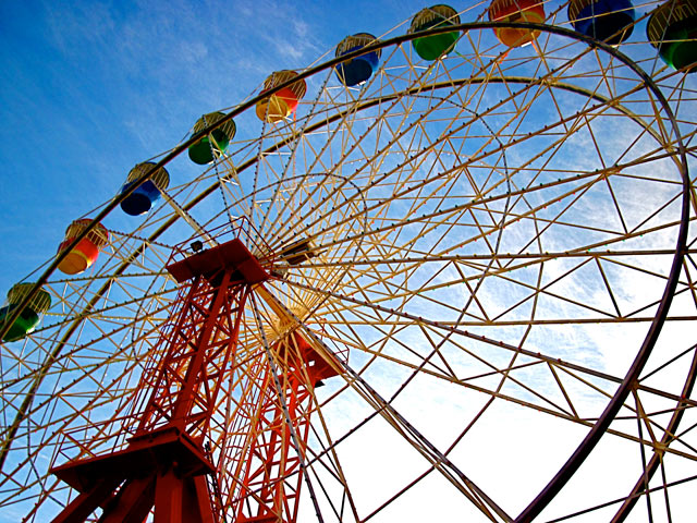
Great subject for the challenge. Nice colors in the wheel. It looks like you shot from the shadowed side. If so I am curious what this would like shot from the brighter lit side.
The colors are nice but it does look like you increased the saturation a bit too much. (I am guessing since the processing details weren't provided. For next time, if you request a critique its a good idea to provide them).
Your composition works well with the subject. The radial lines of the wheel take your eye to the middle of the wheel. The lines on the outside take us out then back into the frame which some might dislike but I personally like in this case.
Overall, a really strong entry for your first challenge. |







 Add photograph to your favorites
 Add photographer to your favorites


