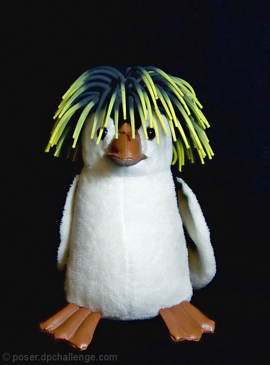
::: Critique Club :::
First Impression:
A good poster style shot.
Focus/DoF:
Seems spot on. I would have gone for a smaller aperture, but only to get a little more detail in the fur.
Colour:
Feels to me as though the brown feet and nose could do with a little more punch, but it is quite realistic the way it is, and I am assuming that was what you were going for.
The belly is a little burnt out, and the black wings are not visible. As you have shot the penguin against a black background, I am assuming you wanted this to happen. However, if you were going for a high key shot, I don't think you've wuite managed it. The detail in the face and the hair are preventing that.
Composition:
It's a bit plain. As you have gone for a centre frame setup, then it should be just that - but as it is there is more space to the right and above the penguin.
Overall, I do like it, but it doesn't really hold my attention for long.
-------------------------------------------------------------
It is my hope that these insights are helpful, and constructive. If you have any questions regarding this critique, please feel free to PM me. Also feel free to PM me with any feedback on this critique. And please remember to mark it "Helpful" if you found it so.
Mark |