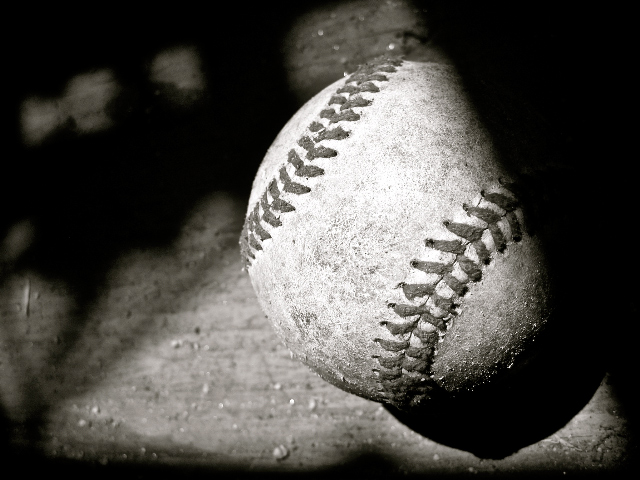
I can't relate this to the challenge "From Above". I don't understand why the ball was left in such a harsh shadow. Maybe moving it more in the light would have made it a better picture. Or did you plan the shot this way to allow for adding text to that area? If that was not the intention, you should consider it to make it a seller.
Okay - this is a really great shot of a baseball....seriously. I love the texture, the tones, great exposure and composition. However, for this challenge I think it just gets lost because nobody cares what a round object looks like from above (for the most part). A ball looks the same from above as it does from the side. I give it a 5 still though - because I really do like the photo.







 Add photograph to your favorites
 Add photographer to your favorites


 Photographer found comment helpful.


