| Author | Thread |
|
|
06/22/2004 06:04:47 PM |
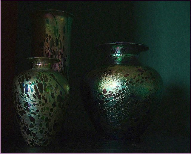
i'd agree the bright spot on the front vase is too much.
i might try lighting from two sides, and not lighting the background, while avoiding shadows.
i could see this working pretty good, although not really my type of photo.
|
|
 Photographer found comment helpful. Photographer found comment helpful. |
|
|
06/22/2004 05:30:15 PM |
|
Really nice idea, and pretty well done. I love the noise, colours and mood. Not too keen on the light reflecting ont he two oval vases - looks a little harsh. Also I think I'd crop so the space on between the border and the left case is the same as the one on the right - essentially making the image squarer. The lighting and text of the background on the right is really nice, but the pic doesn't look balanced to me. Also, I'd have gone with a white border if using one, but I think the photo holds itself in nicely without one. |
|
| Photographer found comment helpful. |
Home -
Challenges -
Community -
League -
Photos -
Cameras -
Lenses -
Learn -
Help -
Terms of Use -
Privacy -
Top ^
DPChallenge, and website content and design, Copyright © 2001-2026 Challenging Technologies, LLC.
All digital photo copyrights belong to the photographers and may not be used without permission.
Current Server Time: 07/06/2026 01:15:16 PM EDT.