| Author | Thread |
Comments Made During the Challenge  |
|
|
11/17/2002 05:13:00 PM |
|
Groovy is right! Good job! |
|
|
|
11/16/2002 08:48:00 PM |
|
|
|
11/16/2002 01:51:00 PM |
|
Well focused, and lit. Good subject. Congrats! Good luck in the challenge. Grayce :-) |
|
|
|
11/14/2002 10:23:00 PM |
|
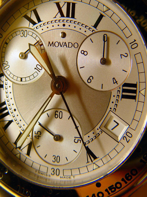
Very nice detail, but I'm having trouble understanding the title? |
|
|
|
11/13/2002 02:43:00 PM |
|
It feels like the crop is a little tight, in my opinion. How did/does it work with a horizontal crop? karmat |
|
|
|
11/13/2002 10:32:00 AM |
|
Very nice!! Good quality photo. Looks like an ad picture for this particular watch. |
|
|
|
11/12/2002 11:55:00 PM |
|
This is so clear. A little to one side but very crisp and clear. Beautiful colors in the watch. Shame about the shadow on the left as you look at it. Still a 6. PTL |
|
|
|
11/12/2002 09:33:00 PM |
|
|
|
11/12/2002 06:44:00 PM |
|
|
|
11/12/2002 06:43:00 PM |
|
more distinct shadows and a slightly different crop would have made great. |
|
|
|
11/12/2002 03:47:00 PM |
|
|
|
11/12/2002 01:20:00 PM |
|
very sharp image. good detail |
|
|
|
11/12/2002 11:15:00 AM |
|
6. Too bad you couldnt get the whole face into thi shot. I took the picture of the IS300 guages which I had a similar problem (fitting a circle into a rectangle), what I chose to do was zoom in so that the framing was closer... IN this instance possible only the top 1/2 of the watch... |
|
|
|
11/11/2002 11:39:00 PM |
|
I want one too ... Very nice ... Got yourself a 10 ... RLS |
|
|
|
11/11/2002 11:30:00 PM |
|
|
|
11/11/2002 07:00:00 PM |
|
i like the clean look and lighting. more light on the bottom to light up more of the 140, 150 numbers, or maybe no light on the ones that show now. I like it. |
|
|
|
11/11/2002 05:00:00 PM |
This could be an ad in a magazine. Crisp, clear, good lighting. Congratulations.
Bitz |
|
|
|
11/11/2002 01:53:00 PM |
|
Nice work, love the lighting here. Justine |
|
|
|
11/11/2002 05:13:00 AM |
|
Absolutely beautiful. Lovely and sharp. Fantastic subject. Great lighting. 10 :) |
|
|
|
11/11/2002 01:01:00 AM |
|
25 images and I finally got a macro with some detail--hard to put someround into a square--7bobgaither |
|
|
|
11/11/2002 12:56:00 AM |
|
good image, would have cropped a bit more |
|
Home -
Challenges -
Community -
League -
Photos -
Cameras -
Lenses -
Learn -
Help -
Terms of Use -
Privacy -
Top ^
DPChallenge, and website content and design, Copyright © 2001-2026 Challenging Technologies, LLC.
All digital photo copyrights belong to the photographers and may not be used without permission.
Current Server Time: 06/28/2026 03:59:59 AM EDT.