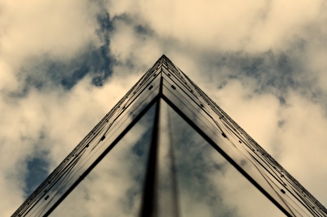
I second Yo_Spiff's tips and would add that you should have played with aperture to get a deeper DOF. I don't like the OOF look of the building in the bottom of the image. Also, your image lacks white, the white on it is not white. But I love the idea and the composition. Hope it helps.
Responding to your "how do I improve?" post in the forums. I looked through your entries and found one that I thought had more potential, but as it is would have probably gotten a 4, or at best a 5 from me. Did my own edit on it. My major problem with it was I didn't care for the dim appearance and strong yellow cast to it. That may have been a creative choice on your part, but anyway, if it helps, the editing steps are in the notes.
Thanks for the comments folks the appreciation and constructive critiscism are both very encouraging and very usefull ... this is the first entry I've made with which I was happy with the last two were unsatisfactory and well we never mention the first !!!
I like how it looks like the lines have been drawn in the sky. The only nitpick I have is that I wish the clouds didn't have a yellowish cast. Still tho, an interesting view!
This really throws me for a loop. I can look at the structure in two different ways and come up with 2 completely different forms. Not sure how this was done but you made me stop and look at it for a bit.






 Add photograph to your favorites
 Add photographer to your favorites

 Photographer found comment helpful.


