Advanced editing allowance went wasted for this pic since it's basically straight out of the camera. If anything the Advanced rules forced me to over edit this a bit since I dodged the boats a little, not sure if It was necessary.
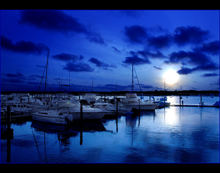
PRE-SHOT: This was taken around 7PM it's not the moon but the sun. used a White Balance that made the bright sunny day look like night. (hopefully it will fool voters) Used 6mm center weighting that resulted in the clouds staying real dark without having to burn them.
POST PROCESS: Single JPEG; Cropped, sharpened, and of course dodged the boats.
Statistics
Place: 55 out of 146 Avg (all users): 5.6642 Avg (commenters): 6.5556 Avg (participants): 5.3934 Avg (non-participants): 5.8904 Views since voting: 1232 Views during voting: 292 Votes: 134 Comments: 14 Favorites: 2 (view)
This is an awesome shot man, looks very "hotpasta" - I gotta think the only reason you were docked points was for some fault in the technicals but STILL below 6.x for this is a travesty. Boats look a bit murky/grainy in the detail and yes maybe over is too 'blue' (and i love saturation), but the clouds and the sky I don't get it, if i voted i would have expected top 10
I think this image scored quite well for this challenge.
You said you hoped you had fooled the voters into thinking this was actually a night scene. Hmm. I don't think you did completely.
Things that could have improved your score.
Composition: Horizon is dead centre, always a good idea to offset it if you are looking for a higher score. I know I often choose to put the horizon dead centre, but I know I will always suffer with the score if I do.
Focus: Seems a bit off to me. Everything appears to be just a little bit on the soft side.
Exposure: The sun is over exposed which I suppose is what you were aiming for in trying to get it to mimic the moon. However, I think you could have achieved this better by reducing the brightness a little bit. It would have looked more realistic I think. You mentioned you didn't really do much editing to this apart from dodging the boats. I think if you had done some very minor tweaks with brightness and levels you would have achieved the look you were aiming for with better results.
I'm personally not a big fan of the blue stripe in your border. I think it detracts from the image. Certainly my eye is drawn to it, away from the image itself.
Overall I think you scored pretty well with this one, but could have scored higher with some very minor editing.







 Add photograph to your favorites
 Add photographer to your favorites

 Photographer found comment helpful.


