| Author | Thread |
|
|
07/05/2009 06:04:32 AM |
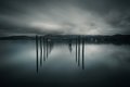
I like the yellow, I think it turns a fairly ordinary image into a really cool abstract shot.
Great composition as well, love the fact you got just the main part of the crane and cut the rest out. |
|
 Photographer found comment helpful. Photographer found comment helpful. |
|
|
06/26/2009 02:32:29 PM |
|
Congrats on your brown ribbon. You will get lots of views. I've had a few browns myself. Actually I like this. Nice composition. Might have done better in the duotone challenge. |
|
| Photographer found comment helpful. |
|
|
06/24/2009 12:04:15 AM |
|
Ouch. I gave it a 7, but I did not expect it to do too well overall. Better to go down in flames with the brown, though! There is a certain bizarre pride to achieving the brown. I am quite fond of mine. Congrats. I think. |
|
| Photographer found comment helpful. |
Comments Made During the Challenge  |
|
|
06/22/2009 01:02:31 PM |
|
Borders on being digital art instead of a photograph, but I like it. |
|
| Photographer found comment helpful. |
|
|
06/22/2009 06:14:40 AM |
|
This should have been a terrific image, but the choice of harsh coloring (which emphasizes the background 'noise'), the tilt of the elements, and the overall darkness just aren't working in the long run for me. |
|
| Photographer found comment helpful. |
|
|
06/20/2009 12:58:01 PM |
I quite like the composition but its far too over processed for me, sorry.
nice idea. |
|
| Photographer found comment helpful. |
|
|
06/18/2009 11:29:17 AM |
|
I really like whatever you did in your processing....looks really cool |
|
| Photographer found comment helpful. |
|
|
06/18/2009 10:11:21 AM |
|
| Photographer found comment helpful. |
|
|
06/17/2009 11:06:49 PM |
|
| Photographer found comment helpful. |
|
|
06/17/2009 09:34:20 PM |
|
The processing really turns this into an abstract piece. The kind of thing that would take some time to begin to appreciate. Im glad I took the time to leave a comment, because it is growing on me. I fear that most voters would pass it over quickly though. 7 from me. |
|
| Photographer found comment helpful. |
|
|
06/17/2009 09:12:43 PM |
|
Wow, that's some heavy-handed processing. It certainly grabs one's attention. It works well as an abstract. I can't say I'm too fond of the yellow, but I really like the way the reddish-orange looks on the side of the building...pen-and-inky looking. |
|
| Photographer found comment helpful. |
|
|
06/17/2009 10:22:12 AM |
|
the yellow is a little much for me. |
|
| Photographer found comment helpful. |
|
|
06/17/2009 07:25:47 AM |
|
Compression errors, ugly false color does nothing to create an interesting impression. Over dark, no detail to speak of. |
|
| Photographer found comment helpful. |
Home -
Challenges -
Community -
League -
Photos -
Cameras -
Lenses -
Learn -
Help -
Terms of Use -
Privacy -
Top ^
DPChallenge, and website content and design, Copyright © 2001-2026 Challenging Technologies, LLC.
All digital photo copyrights belong to the photographers and may not be used without permission.
Current Server Time: 06/28/2026 10:46:11 AM EDT.