Generally speaking, in basic editing, you can go as far with editing as you want SO LONG AS every change you make to your image is applied to the ENTIRE picture... i.e., no selective editing of specific parts of the image, etc. Def read the rules and feel free to ask questions thru PM or in the forums if you have questions.
thanks for all the help.i was worried about editing the photo to much because of the the basic edit rules. i will review them and try to due better next time
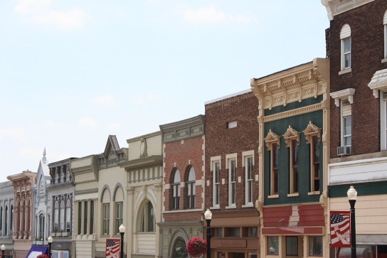
I think that the subject matter you chose of the differing building facades was a worthy one, but I think the final result lacks impact as a photograph for reasons that I will spell out.
1) Right off the bat, make sure you crop your longest side to 640px - you will get low scores every time for submitting a smaller sized image like this. Images are easier appreciated when they are larger, take advantage of the size limit.
2) Your image needs contrast. It looks like it is straight out of the camera, and most of the tones looks drowned out. This could easily be fixed in photoshop through the use of Levels or Curves. You may find the tutorial section of this website helpful on this point.
3) The sky is almost completely blown out. Nobody likes a boring, white sky, unless it is clear that the blown out sky was an intentional photographic choice. Otherwise, it is considered a technical flaw that a conscious photographer should avoid. Going along with this, the blank sky takes up a huge portion of your image, and I don't believe it adds interest. A vantage point that placed more emphasis on the very interesting buildings I think may have been more successful.
It looks to me like the sun is behind the buildings. This is bad for 2 reasons: One, in order to get a proper exposure for the buildings, you have to overexpose the sky which I mentioned is not flattering, sort of washes out the whole image. And Two, Sunlight would have made the facades themselves look cooler b/c the shadows would reveal more details and such and provide more interesting things for the eye to hold onto.
As a general rule, I do NOT include the sky as a prominent feature in my images unless it is a dramatic, cloud filled sky. Midday, plain blue skies are simply not photogenic unto themselves unless incorporated in interesting ways. I would like to see how this shot looked at say dawn or dusk, whichever time period has the sun shining ON the buildings from the left hand of the frame...
4) You have to pay attention to the details. The chopped off flag poles and baskets et al give a sense of incompleteness and give the viewer the impression that the image was not strategically composed. These details need to be addressed - either avoided entirely or cropped more satisfactorily as to make them worth something.
Remember, think of photography like a painter thinks of his painting: The painter actively chooses every element of their painting, and so should you, as far as you can. Don't "paint in" elements of the composition that don't add anything to your image... because if they don't add anything, then they detract. Every piece of the composition should be a conscious decision - make sure that every element you chose to show the viewer adds something their experience. Sorry for the ramble there :P
And I apologize if I came off being harsh or anything like that, I just wanted to throw out as much humble advice as I could think of in hopes that it may help! Again, I think the subject matter is really cool and good eye for spotting it, but I think you can improve on this shot. Good luck to you and welcome to the site, it really is an amazing place, I learned everything I know from it!
I like the idea but cutting off the bottoms on the buildings isn't working here. You also need to pop the colors more by increasing contrast or saturation so it isn't so flat.