| Author | Thread |
|
|
06/13/2009 11:10:42 AM |
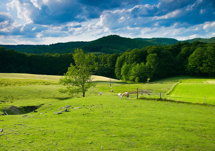
The colors seem a little harsh, in particular the sky which appears to be a turquoise color. Some adjustments in hue/sat would improve this:

Message edited by author 2009-06-13 11:58:11. |
|
 Photographer found comment helpful. Photographer found comment helpful. |
|
|
06/11/2009 12:31:41 PM |
I like the different green hues that you have captured in the photo overall. The limeness of the grass with the darker hues in the trees in the background and in and out of the shadows aer really appealing to the eye. I also really like the sky as well, it is very animated and interesting.
I think the placement of the dip on the left side is really good it draws your eye to it and the line that is there leads you further in and to the tree. Overall its an interesting photo to explore, but at the same time is limited to a few things for your eye to find subject wise. If this makes sense. |
|
| Photographer found comment helpful. |
|
|
06/11/2009 10:15:22 AM |
|
I am so very envious that you live in such a beautiful area...Vermont has so much to offer...I like the openness that I get from this...how it goes off into the distance of the mountains...so very pretty... |
|
| Photographer found comment helpful. |
|
|
06/10/2009 12:01:08 PM |
|
I love the scene and looks like it has loads of potential--my criticism would be the empty foreground. Seems as if it overpowers the rest of the picture. I wonder if a slight shift to the left would have allowed you to included the line of the creek leading to the tree/trees??? |
|
| Photographer found comment helpful. |
Home -
Challenges -
Community -
League -
Photos -
Cameras -
Lenses -
Learn -
Help -
Terms of Use -
Privacy -
Top ^
DPChallenge, and website content and design, Copyright © 2001-2026 Challenging Technologies, LLC.
All digital photo copyrights belong to the photographers and may not be used without permission.
Current Server Time: 07/21/2026 04:51:54 PM EDT.