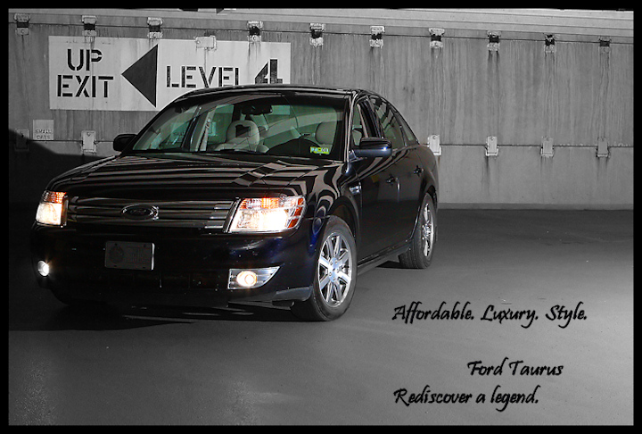
taken in complete darkness, the stupid parking garage closed down at 9pm and they shut off all the lights. Used manual focus just so I could get a shot off...had my wife stand to the far right holding up a slaved 580 EXII....took a few shots to get the composition I wanted due to not being able to see anything other than headlights. Would have liked to set up another flash on the left side to light up the front a tiny little bit...but it was getting late and I was tired....shot a wedding that afternoon.
processing is all regular stuff (levels, USM, etc.) with selective desat.....even though I know that DPC hates it.
First entry since my hiatus, expecting around my average.
Statistics
Place: 59 out of 68 Avg (all users): 4.9198 Avg (commenters): 5.1667 Avg (participants): 4.8125 Avg (non-participants): 4.9462 Views since voting: 1056 Views during voting: 344 Votes: 162 Comments: 9 Favorites: 0
The ront of the car really needed some additional dispersed light as it is too dark and the details can't be seen. Great composition though of the overall image.
This is an interesting location you've shot this one it, in some way's it's a lot better than all the sunset / forest type ones so far. I also like the composition, this feels a lot like the closing shot you see in a TV add where they put all the small print along the bottom!
The text is good, it is small, out of the way but still readable, you've made the ad all about the car, which is exactly how it should be.
Unfortunately I think this one's let down in a big way by the exposure / lighting. The lower left hand side of the car and a large part of the front are in darkness. This is the area that defines the look of a lot of cars and distinguishes them from all the others, so you really want this part to be properly exposed.
I'm going to give this a 7, just because of all the aspects I like about it, I would probably have made it a 9 or 10 if it wasn't for the darkness along the front.
i like the theme and the choice of the gray concrete background to emphasize the paint job - but the lines across the hood are very distracting to the car and the font choice doesn't really come across well - the text of the garage is block like - i think the text should be similar
Composition is off, the car is pointed to the left leaving all that dead space to the right. The signage in the background is distracting, doesn't add to the image. The image/car's front end is too dark (could be the camera is metering off of the turned on head lights.) I think the image would have work better if you had moved the car to the right of your setup getting the parking level sign out of the image. Recompose the image using rule of thirds so that car is leading into the frame instead of exiting the frame. Just my honest critique.





 Add photograph to your favorites
 Add photographer to your favorites


 Photographer found comment helpful.


