My new toy. Got it for a song, and have had to do a lot of TLC, BUT that's the fun part! =D
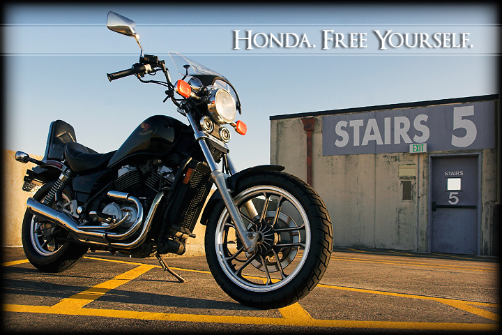
Took the bike to the top of a parking garage that I have used in the past for auto shots. Waited for the sun to move a bit and then fired away! I will upload some of the outtakes after voting.
Adj. in RAW.
USM 300,.3,3
Levels for range
Curves for contrast
++ Saturation
Resize for DPC
USM 90,.6,3
Text
Feathered selection for border
Save
[May. 29th, 2009 04:11:23 PM]
I'm a little pissed at all you DNMCers out there. It's been said before but there are multiple definitions words. Look it up.
Statistics
Place: 36 out of 68 Avg (all users): 5.4734 Avg (commenters): 5.8182 Avg (participants): 4.8667 Avg (non-participants): 5.6043 Views since voting: 4201 Views during voting: 381 Votes: 169 Comments: 14 Favorites: 0
I think you know immediately why this only scored 5.47. If you wanted to get a higher score, then you should not have entered a bike in an automobile ad. Langdon's description even mentions cars, so honestly, you took a risk and you probably knew it ahead of time.
That said, I think the image itself is great. The composition is excellent. The sky, however, feels a little over exposed, always challenging in such bright sunshine not to do that. The bike itself could benefit from being a little bit lighter, but again, not a biggy. The graphics also work, although I perhaps would have left off the border. I think there is a conflict between the cleanness of the advertising graphic and the grunginess of the border, so I think I'd do without the border.
Overall I think this was very well done, but I'm not surprised it didn't do better. In a different challenge I expect it would have been around 5.8 - 6.00.
ice composition of this image. The picture is well balanced, clean and interesting. I think the crop on this is pretty good as well, and the presentation of it is also very good from an advertising sense.
Prehaps the bike could have been a little bit lighter, just so that we can see a little more detail in it. Being Black, it is hard to get the right level of exposure to show detail, while still being the orrect colour.
A good submission for the challenge
Nice clean image. You may get hit a bit from the folks who take "Automobile Ad" litterally. This picture makes me want to hop on and ride. I gave you an 8.
A really nice entry - very cool lighting and background - the theme and the slogan are outstanding - i am sure you are going to be pounded by the DNMC police for not being a car - but I think it a great entry






 Add photograph to your favorites
 Add photographer to your favorites

 Photographer found comment helpful.


