Thanks so much for the good score and the comments.
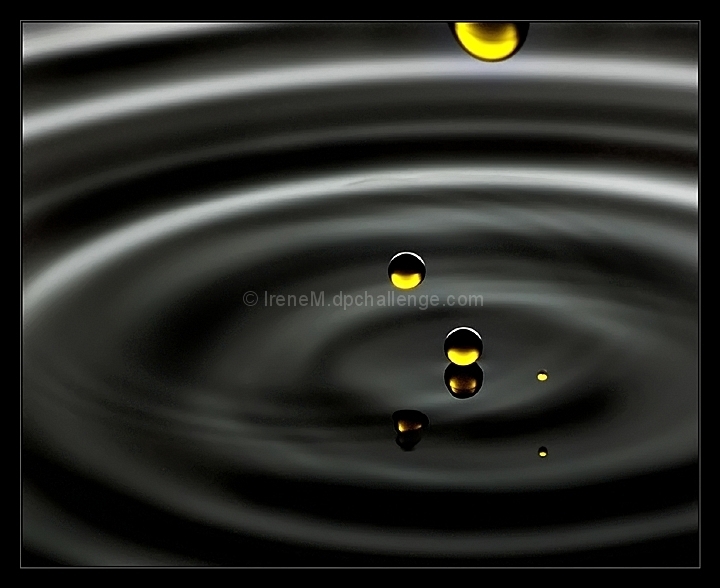
As much as I love your comments Teafran, I have to disagree with you this time. The drop at the top really makes the shot for me. And for ELLIPS. They are most definitely water drops. Ordinary tap water with a touch of ink.
Statistics
Place: 11 out of 125 Avg (all users): 6.3480 Avg (commenters): 8.3846 Avg (participants): 6.1837 Avg (non-participants): 6.4000 Views since voting: 2402 Views during voting: 390 Votes: 204 Comments: 18 Favorites: 3 (view)
Irene, this got a TEN!!! and deserves the TEN !!! , You can bet I am going to emulate this one of these day. Brilliant and you got it right. The drop at the top adds positively to the shot IMO. Into my favs!
Effective use of lighting to make the droplets stand out so well. Good clarity in the lower droplets and the ripple effect on the water adds to the shot.
Very classy abstract image, pure, simple, attractive.
The frame was not needed IMO, and is even slightly distracting.
I'm curious to know how you made that, not sure the drops are drops...
excellent technique !! love the timing and the reflections. Irenem like but it just seems a little grainy on my screen(maybe it is just my screen). The composition of the droplets is wonderful. 1st 10 for the challenge.
Brilliant execution. I have no choice but to give a good mark here, but I've seen a little bit too many shots like this before. Nonetheless, brilliant shot.
This image has been viewed four times and it's always been with the same result - the large dark drop in the foreground is annoying - as in very annoying - and it ruins what is otherwise a terrific concept and construction. Perhaps it's the odd shape or the fact that it just seems out of place, it does negatively impact the image. Still, it's a great effort and works well as a challenge entry.





 Add photograph to your favorites
 Add photographer to your favorites


 Photographer found comment helpful.


