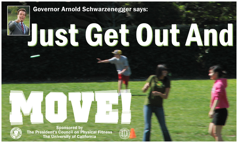
My entry into the Stock: Fitness challenge, made into a billboard with added type, graphics, and photo.
Entry:
It was, of course, trashed for the blur ...
The presence of sharp images in the foreground renders the blur of the background image largely irrelevant, as the eyes will focus on the sharp parts of the scene -- the message -- especially when it's probably going to be viewed briefly from a moving car. The sharp type and inset image also make the blurry BG appear to be a DOF artifact.
The blurriness of the BG image is also helpful in making the image usable as stock without a model release.
I like this one the best. The one with less blur gives the impression of more motion...(now how does that work?!) Nice touch that the word "move" is moving too! Oh...and cool pic of Arnold...;-)





 Add photograph to your favorites
 Add photographer to your favorites


 Photographer found comment helpful.