| Author | Thread |
|
|
04/13/2009 02:22:27 PM |
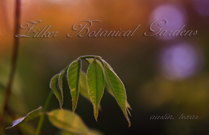
I think this is beautiful! If I were in the marketing department of Zilker, I would want to purchase this from you!
|
|
 Photographer found comment helpful. Photographer found comment helpful. |
|
|
04/13/2009 12:17:10 AM |
|
way too subtle for this crowd. Lovely. |
|
Comments Made During the Challenge  |
|
|
04/07/2009 01:56:08 PM |
|
| Photographer found comment helpful. |
|
|
04/06/2009 07:01:58 PM |
|
Nice shot, IMO a flower or flowers would have made it better. |
|
|
|
04/06/2009 04:37:31 PM |
|
| Photographer found comment helpful. |
|
|
04/06/2009 12:01:38 PM |
|
like the shot but wish the lettering were higher up. Looks like it's crushing the leaves! |
|
|
|
04/06/2009 10:05:28 AM |
|
A little to colorless for me for a botanical garden but nice dof on the plant. |
|
|
|
04/06/2009 10:03:03 AM |
|
Interesting choice to represent Zilker (which I know). The image is moody with great DOF, but as a postcard.... hmmm. |
|
| Photographer found comment helpful. |
|
|
04/06/2009 09:40:11 AM |
|
this has nothing to do with my voting but i got confused because the cursive Z is vaguely reminiscent of a normal cursive capital L. amazing use of the shallow dof |
|
| Photographer found comment helpful. |
|
|
04/06/2009 08:31:30 AM |
|
There is an interesting optical illusion here - I get the sense that the image is a trapazoid - it's not, but that's the illusion I get. The reason is that the title isn't level. The Austin, Texas is and that's why. Interesting effect - I have to remember that. I might have picked a little better subject than the one the author did, but the DOF control with the image is terrific. There are two ways this could have gone - I think you picked the correct concept, but the wrong subject. However, the font and font color matches the theme and overall tone of the image. |
|
Home -
Challenges -
Community -
League -
Photos -
Cameras -
Lenses -
Learn -
Help -
Terms of Use -
Privacy -
Top ^
DPChallenge, and website content and design, Copyright © 2001-2026 Challenging Technologies, LLC.
All digital photo copyrights belong to the photographers and may not be used without permission.
Current Server Time: 07/07/2026 01:17:39 AM EDT.