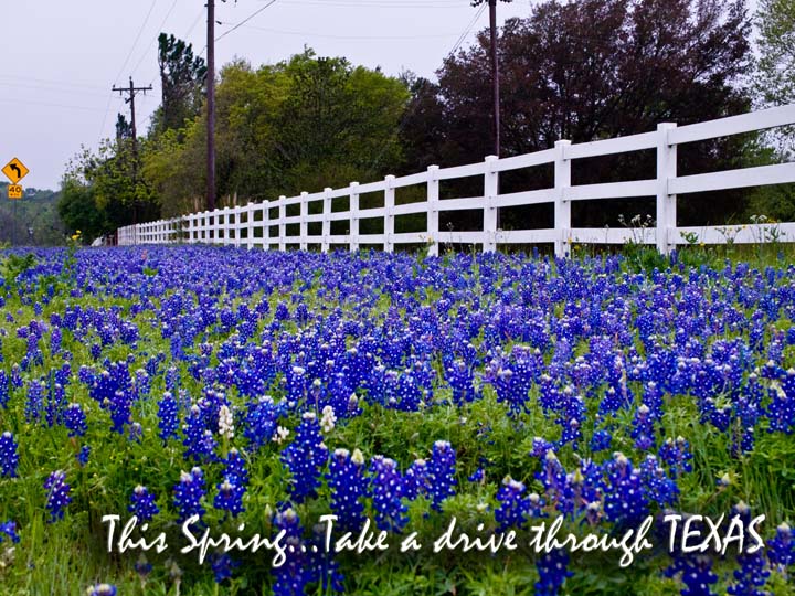
I think this shot would have been better served by having the bluebonnets in the foreground in focus as opposed to what looks like the fence being the focal point.
Like it - the slight fade in the colors towards the upper left is excellant and the sense of dimension is very complimentary to the image in extant. I like the way the author handled the font placement although it's not the best choice. Well done.





 Add photograph to your favorites
 Add photographer to your favorites


