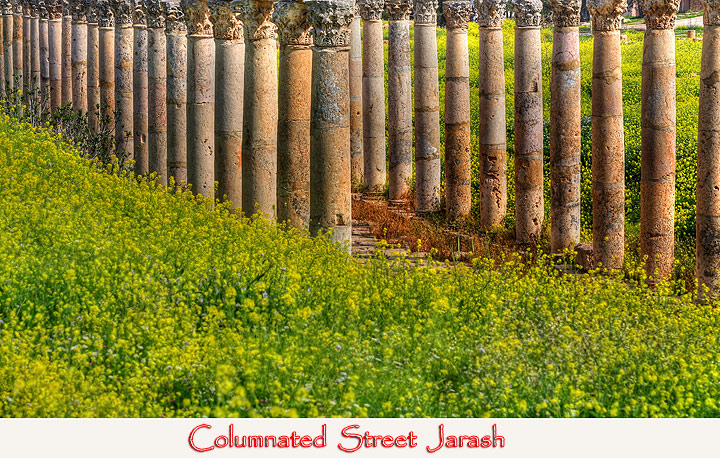
Another excellant treatment of an iconic area of the world. Lush greens and yellows only serve to compliment the earth tones of the columns. The font is a great selection to compliment the columns. Well done.
Nice shot , but the way the tops of the columns are croped is to tight IMO. Maybe a different angle. But looking at the tops of the columns the background may have been to busy for a different angle.
I cant really make out from the perspective if this is a fence or big statues. I think a better perspective and crop would have worked. I love the colors tho.
I feel the composition of this image would have been stronger if it was not cropped so close to the top of the columns. All the elaborate detail at the top draws my eyes off the page.







 Add photograph to your favorites
 Add photographer to your favorites


 Photographer found comment helpful.


