| Author | Thread |
|
|
04/17/2009 01:22:12 PM |
|
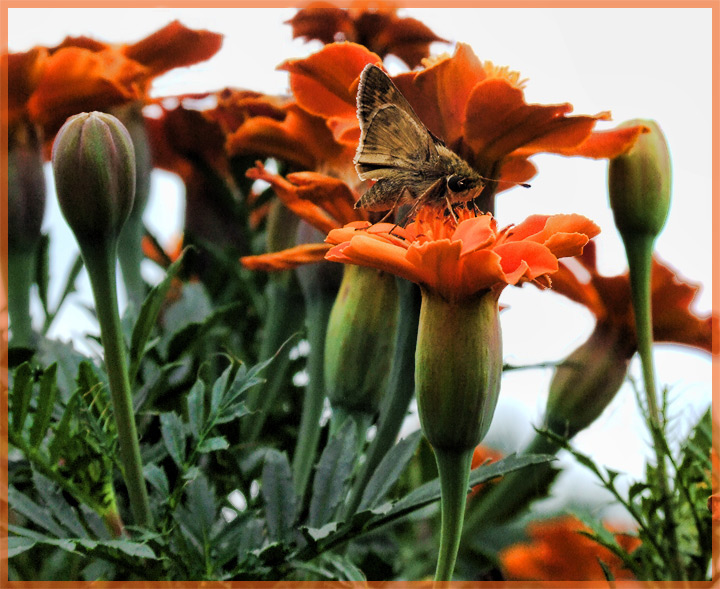
Great crop, the shallow DOF is really amplified by it, but yeah, change the transparent border to a color that doesn't match the other dominant color/where you want the eye to go, maybe something in the green range. If there was more room on the top, then the orange border wouldn't pull my eye away as much. |
|
 Photographer found comment helpful. Photographer found comment helpful. |
|
|
04/16/2009 08:36:36 AM |
|
Very good choice of crop on this one. Normally I wouldn't mind the border, and it worked just fine for me until I looked at the original. Then I realized I don't want it on at least the top, to give it a bit more "freedom" if you will. |
|
| Photographer found comment helpful. |
|
|
04/05/2009 07:43:56 PM |
|
Excellent edit Kelli. Much more impact and I like your orange border. |
|
| Photographer found comment helpful. |
|
|
04/05/2009 12:20:45 AM |
|
I really like this....except, as you guessed, the border! Why would you want the border to compete with the orange flowers? Green maybe might have worked, or the more traditional black or white! One other editing detail, you've picked up some shadow/halos on some of the flowers (e.g., top left). You might try to blend or lighten thouse a bit. Very pretty! |
|
| Photographer found comment helpful. |
|
|
04/04/2009 11:14:45 PM |
|
You've really made the flowers pop, the crop works great and the little moth now stands out wonderfully! I think the orange border is fun :-) |
|
| Photographer found comment helpful. |
Home -
Challenges -
Community -
League -
Photos -
Cameras -
Lenses -
Learn -
Help -
Terms of Use -
Privacy -
Top ^
DPChallenge, and website content and design, Copyright © 2001-2026 Challenging Technologies, LLC.
All digital photo copyrights belong to the photographers and may not be used without permission.
Current Server Time: 07/17/2026 04:18:47 PM EDT.