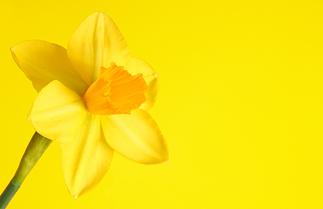
I'm at a loss as to why this scored where it did. I LOVE it on yellow! Perhaps had you ignored us and gone with black... well, it worked for the first three. But I still say it's much better this way.
Interesting choice to put it against a yellow background. Sort of in-your-face cheery. The flower is well lit and detailed; maybe would like some depth to the background.
Unfortunate - too much yellow. If the background were lighter allowing the flower to stand out, it would have been almost perfect. Another idea would have been to use a contrasting color - not black because that would just make it cliche, but something different like a light purple or blue - magenta would be excellant. The other issue is that it's a tad over sharpened which I think the author overused to differentiate the flower from the background. Another reason to use a different background.




 Add photograph to your favorites
 Add photographer to your favorites


 Photographer found comment helpful.


