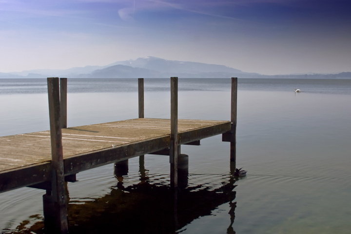
7 - Looks like this image may not be appreciated at this size and the detail might be there 'wall sized' - nice scene and image although I wonder about a variation in the cropping - not sure how, just seems a little off balance. I'm guessing others have pointed out the typo.
I like it overall...I would have crouched down a little so the top of the posts weren't on the horizon...the swan works here, but might be too far away...7
Attractive, but too much flaws to be a winner IMO: light a bit flat, the swan too little, and the poles exactly on the horizon line...
But the mood is very nice







 Add photograph to your favorites
 Add photographer to your favorites


 Photographer found comment helpful.

